
[🔬 onboarding dissection] Clearcue top 3 activation moves


What is Clearcue?
Clearcue is a B2B prospecting tool. You tell it who you sell to and what kind of buying signals matter to you (it actually helps you define those), and it gives you a list of companies and people that match: the ones most likely ready to buy now, before your competitors get to them.
I've been reviewing a lot of prospecting tools lately, and Clearcue's onboarding stood out for a specific reason: it doesn't just promise a first meaningful win; it delivers one, in minutes, within the first-run experience. And that's rarer than it sounds.
Here's what I think every B2B SaaS founder should steal from it:
Clearcue's onboarding makes a complex prospecting setup feel like a 5-minute conversation.
Here are the 3 activation moves Clearcue gets right + 2 bonus I think you should pay attention to.
TOP 1 — The first meaningful win promised at signup is delivered within the first-run experience
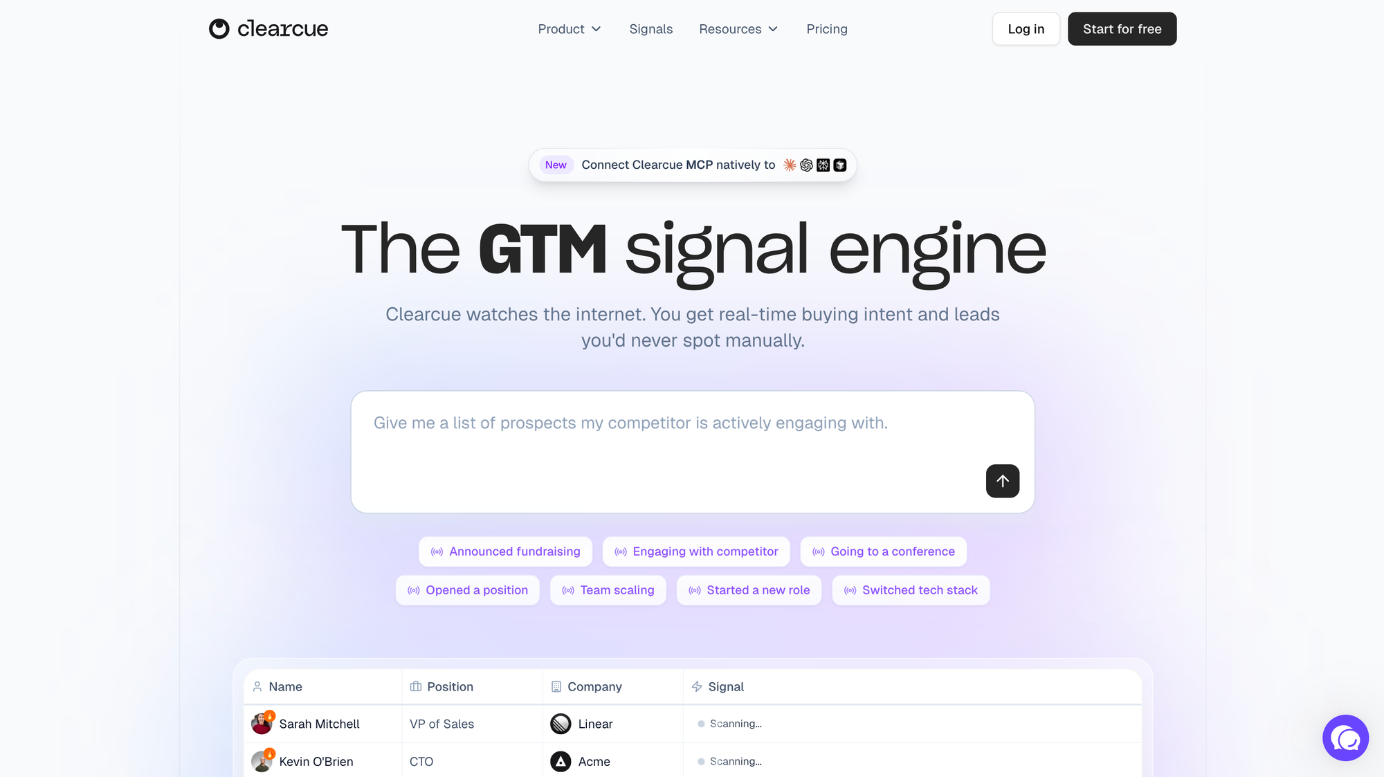
The landing page sets a very specific expectation: "see who's ready to buy this week, before your competitors do." That's a clear, time-bound and motivating promise (and the kind of thing most products under-deliver on, based on what i've seen).
And Clearcue truly delivers on it.
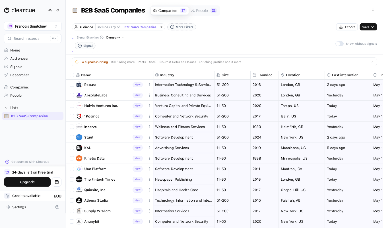
By the end of the first session, the user has actually seen a list of relevant companies with associated buying signals. And that list list is based on their own context, with buying signals tied to their actual ICP (and most of the work has been done by the product itself).
The 2 biggest reasons why people don't come back after session 1 are:
- they didn't reach a moment of meaningful value
- the value they experienced differs from the one they were promised (in a bad way)
A first meaningful win that lands in the first session doesn't just prove the product works, it also proves the promise was honest and kept.
And this is a huge trust builder. Because function isn't the only component of adoption and retention. We also need people to trust us.
TOP 2 — The AI setup chat sequences four aha! moments back-to-back
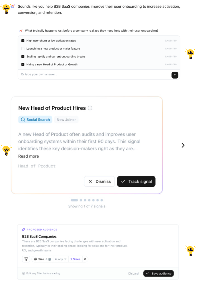
What could have been a (too) generic "configure your account" step is instead the engine of the whole onboarding. The user opens a chat with the AI, and inside that single conversation, four aha! moments stack up super quickly:
- "It scanned my website and gets what I do". Clearcue fetches and recaps the user's biz back to them and saves them the hassle of explaining who they are and who they target. This first impression makes the user feel seen and already proves product competence.
- "It's suggesting trigger events I hadn't even thought of". Relevant prompts, plus visible thinking from the AI as it generates suggestions. Another proof of relevancy + competence.
- "The first signals are personalized to my context". The user can clearly see those signals are not vague, generic templates. They are super specific. Trust + Relevance + Competence = UP (again).
- "The audience proposition is relevant". Another proof of competency + a sense of control as the user can edit what the product returns them.
And a few smart details that make the whole thing breathe:
- The first message in the chat is auto-written "from the user". It instantly teaches you you can chat in plain language, and how to interact with the tool, on a conversational mode.
- Suggested answers come paired with a free-text field. Guidance + freedom = competency + control. And that's exactly the feeling that keeps people moving forward instead of freezing.
This whole sequence is the spine of the onboarding. By the time the user clicks the final button, they've already had 4 small wins in just minutes.
According to the Peak-End rule, ending every session on a positive feeling is what builds trust, positive associations with the product, and makes user way more prone to come back. The ONE thing to avoid? Ending a session (especially the first one) on a bad note (confusion, bug, irrelevant results, nothing?)
TOP 3 — The wait between setup and results is engineered as a show, not a boring loading state
I love this one because it does so much in the same time.
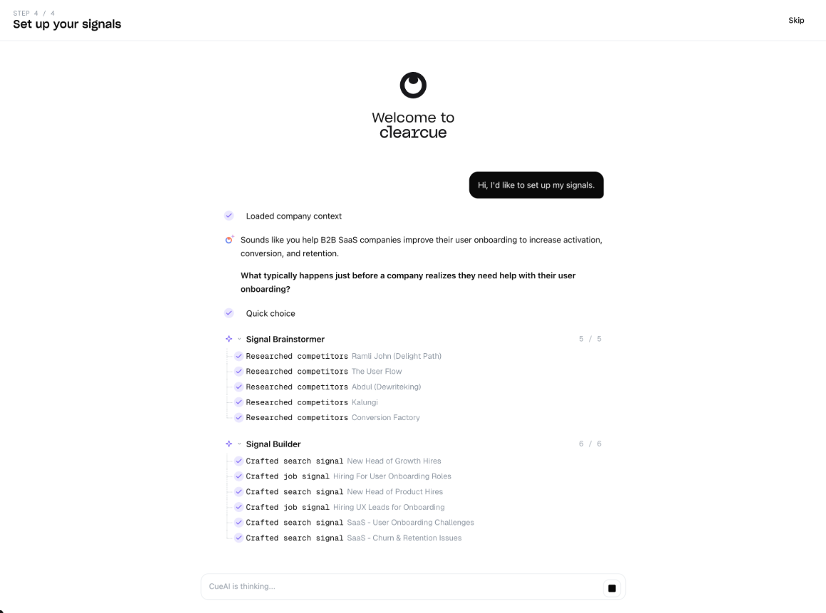
During the AI setup phase, Clearcue does a many tasks on the background. The simplest way to handle this would have been to put a spinner on the screen and write "loading".
But here Clearcue's UI shows the user how the process unfolds, step after steps.
This does multiple, very important things:
- an illusion of labor: the user sees the work being done
- proof of competency: the system isn't hiding, it's showing its homework
- process transparency: no black box, no anxiety
- perceived value: if it's doing that much, it must be worth it
The user could have been the hostage of a spinner, but here they are an audience watching the magic happen. And by the time the results land, trust is already built, before the first meaningful win even arrives.
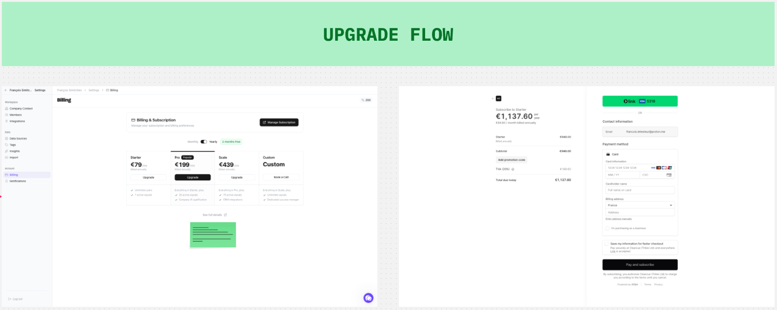
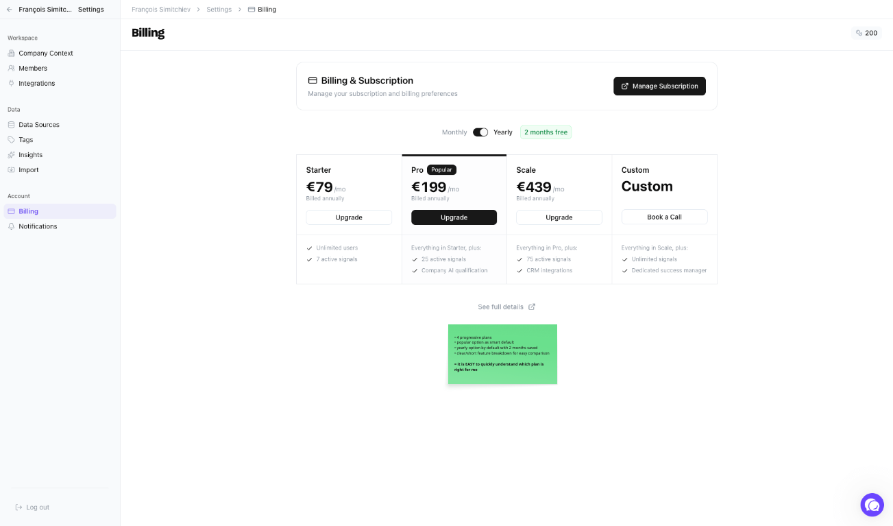
Bonus 1 — The upgrade flow is easy to navigate
Many upgrade flows are too complex: too many plans, dark patterns nudging you toward the wrong one, confusing or too extensive feature comparisons.
Clearcue's is the opposite: 4 progressive plans, a "most popular" smart default. Yearly selected by default with the 2 months-saved discount visible. A clean, short feature breakdown for easy comparison. It is easy to quickly understand which plan is right for me, and that's the whole point of a pricing page: users should be able to make a decision in seconds.
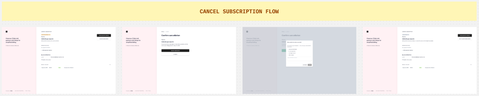
Bonus 2 — The cancel flow is NOT a stack of dark patterns
Honorable mention, and a rare one: canceling a Clearcue subscription is genuinely easy.
No 7-step retention guilt + shaming sequence. No "are you sure?" loops. No surprise downgrade offers or whatever other gimmicks designed to force you into staying. No phone number to call and no email-the-team-to-cancel nonsense.
Instead, just a clean, respectful flow. Users will definitely notice and remember their last experience with Clearcue as a positive one.
Because unless your product is BS, doesn't work or delivers the wrong value, there are only 2 reasons users will churn:
- the product is not for them (or not anymore)
- the product is too expensive for them
And letting them go easily and quickly is the exact reason they would recommend our product to other people if they believe it can help them.
What to take from this
3 things stand out to me about Clearcue's approach:
- A first meaningful win in the first session isn't a nice-to-have. It's the activation event. Everything else in onboarding is in service of getting there.
- A configuration or setup phase can be the most valuable moment of the onboarding, if you turn it into a guided conversation that produces relevant aha! moments instead of just collecting inputs.
- Waiting time is design space. If your product does work the user can't see, show it. Make the invisible visible. Process transparency is a huge opportunity to make time feel like it passes faster, and most importantly to build trust and perceived competency and value.
Oh and one more thing: treating users with respect at the upgrade and cancel moments should not be optional: it's the foundation of repeat business.
If there's only ONE lesson
Our onboardings shouldn't promise a first meaningful win. They should deliver it and in the first session, before the user has time to have second thoughts about why they signed up in the first place; or worse, simply forget about us or go see a competitor.