
[🔬 onboarding dissection] Miro top 3 activation moves

What is Miro?
Miro is the online collaborative whiteboard most product teams have either used, currently use.
The promise: a shared infinite canvas where teams can think, plan, brainstorm and align, visually, in real time or async.
I eat B2B SaaS onboarding for breakfast, and Miro's been on my list for a while. They're a category leader, they've nailed PLG at scale, and their onboarding has had a lot of love poured into it over the years. So I gave it a proper walkthrough.
Spoiler alert: I was expecting some wows I actually didn't find and was a bit disappointed (you'll know what in the conclusion of this post). But I didn't get that disappointed because I know what kind of users Miro is targetting. And those users don't need the things I was disappointed not to see. That's what you get when you become the leader in your category.
Here are the top 3 things Miro's onboarding does well and I believe are worth looking at if you're a B2B SaaS founder building a tool with rich functionality, multiple use cases and learning curve to manage.
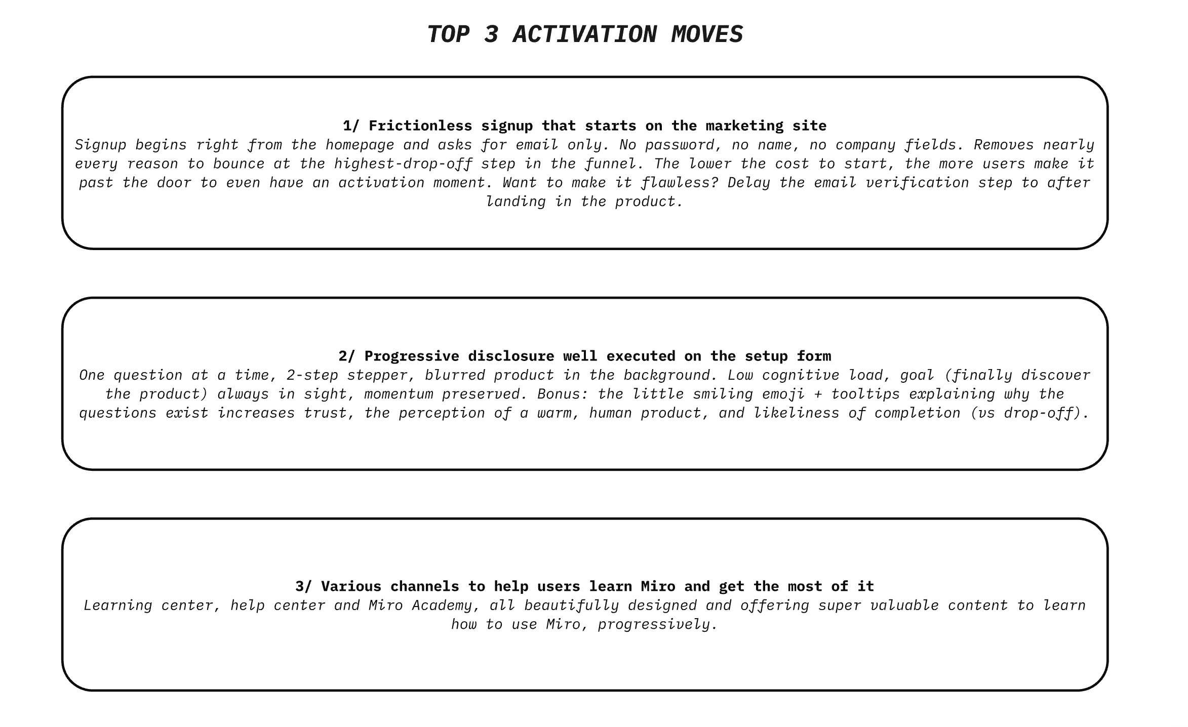
TOP 1 — Frictionless signup that starts right on the marketing site
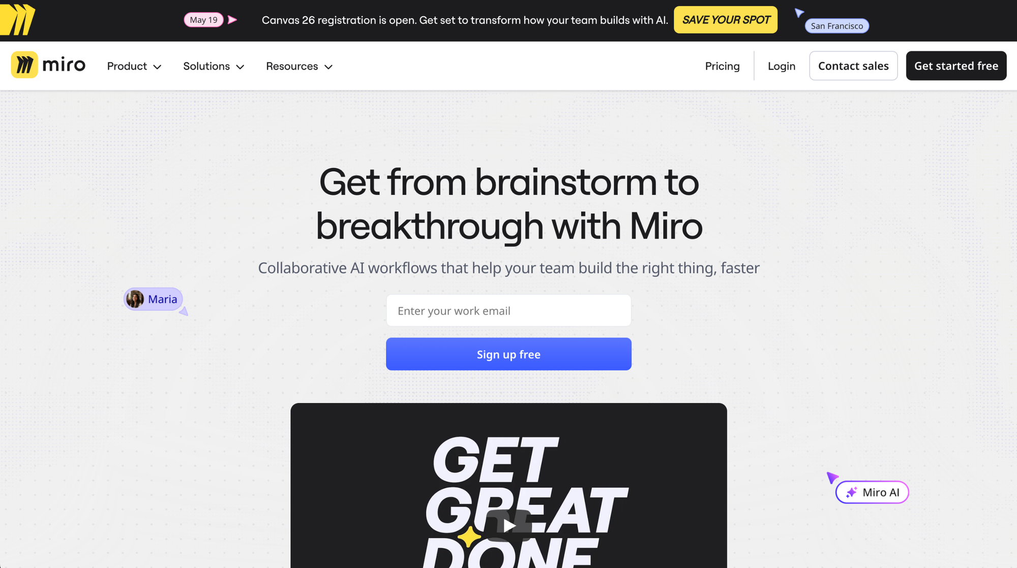
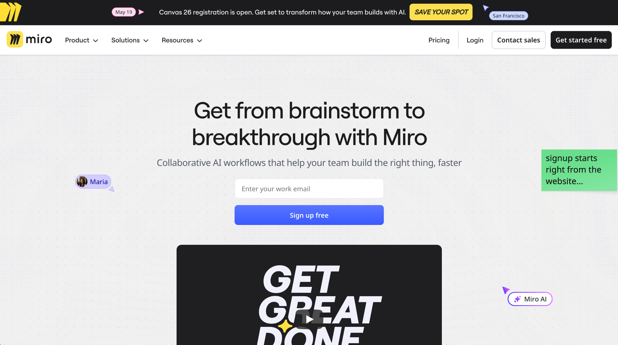
The signup form lives directly on Miro's homepage. There is a "Get started free" button taking you to a separate page, offering various signup options. But Miro does something I've never seen before here: they provide a shortcut. Enter your work email and get to the next step. No multi-field form. Just an email field, right there, in the hero section.
That's it. No password, no name, no company.
This may sound not that important, but it is.
The signup step is statistically the highest drop-off point of any SaaS funnel. Every additional field, every extra screen, every "create a password" requirement is additional friction and a chance for the skeptical user to bounce. Well in Miro's case, the product is the top 1 player in its category, so they can afford a little friction...
But still, Miro's logic here is the law of least effort taken seriously: the lower the cost to start, the more users make it past the door to even have an activation moment.
What's smart is they treat the signup field as part of the marketing page itself, not as a separate transaction. The user doesn't "go sign up". They just type their email, and they're already in motion. The mental shift from "browsing the website" to "trying the product" disappears. And the email input is placed right next to a video that shows the product in action, and demoes its value.
•••
If I had to push them further, I'd actually delay the email verification step that follows to after the user has landed in the product and experienced some meaningful value. Right now, you have to go check your inbox before getting in, which breaks the momentum that the email-only field worked so hard to build. But that's an opportunity, not a critique of what they're doing here. This signup shortcut is already so good.
The signup form is not a form. It's a momentum decision. Every field you add costs you users that would have activated. Ask yourself for every single field: "Do I need this right now, or can I collect it later, when the product has earned the right to ask?"
TOP 2 — Progressive disclosure well executed on the setup form
Once you're in, Miro asks you a few questions to set things up. Standard onboarding move.
But the way they execute it is worth dissecting.
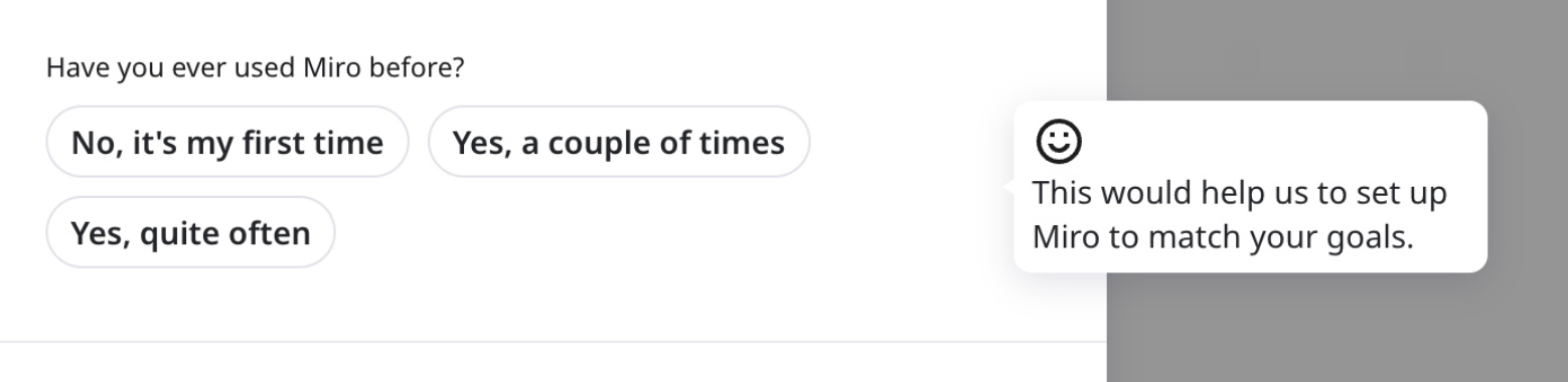
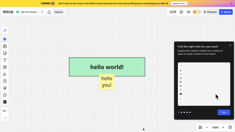
One question on the screen at a time. A simple 2-step stepper suggesting it will be quick. And in the background, a blurred view of the product itself, taunting you.
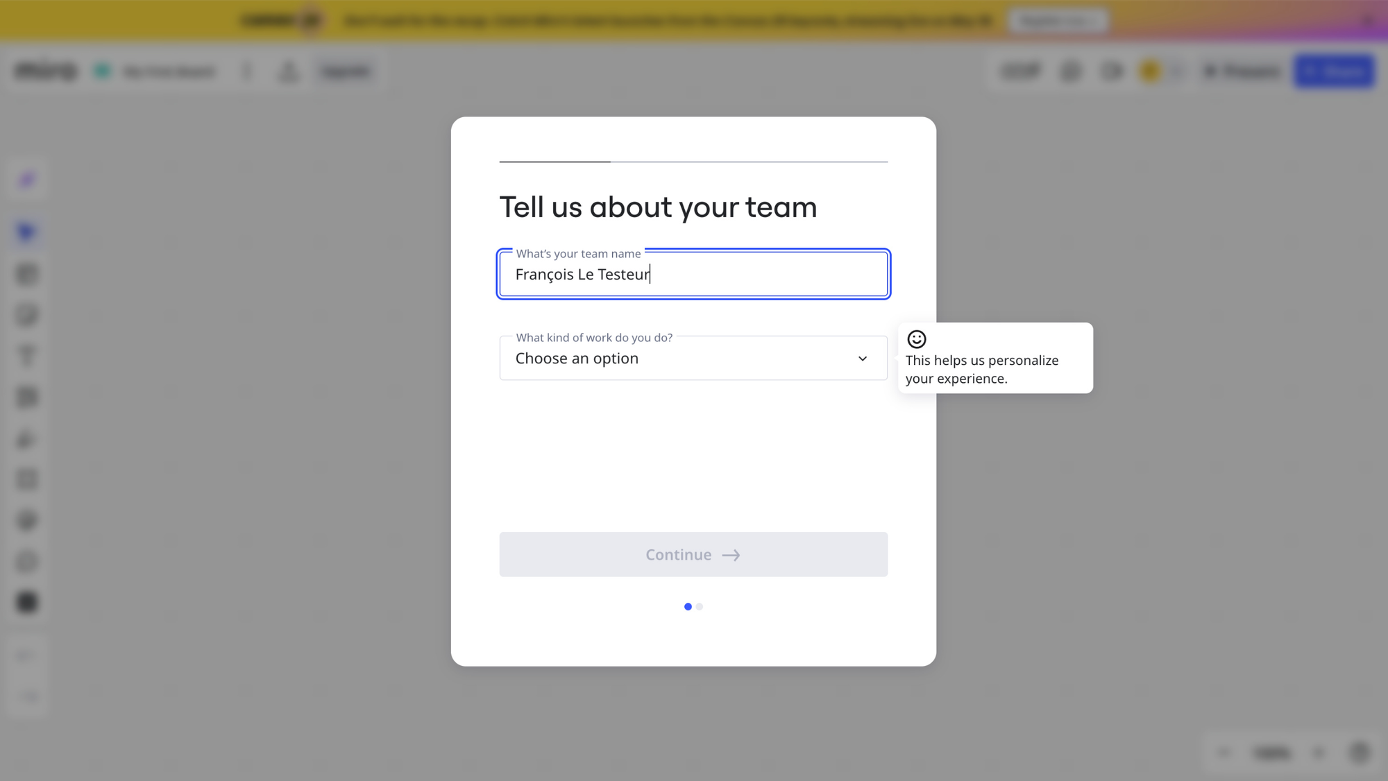
That last detail is doing a lot of work.
The user has just signed up. They're motivated, but that motivation is volatile. Showing them a configuration form with 8 fields could kill it instantly. Instead, by revealing one question at a time, Miro keeps the cognitive load minimal and the perceived effort low. Each screen feels like a tiny task. And tiny tasks get completed.
The blurred product in the background is the goal-gradient lever: the destination stays in sight. The user can see they're almost there. The product is right behind the form, just a few clicks away. Motivation goes up, not down, with each step.
And then there's the small things, that aren't small at all:
A short "why we ask this" tooltip on the more sensitive questions. It explains the value exchange. The user gets why they're being asked, and what they'll get in return (a more relevant experience). The presence of a smiling emoji in those tooltips adds a feeling of warmth and humanizes the interface. It sparks a little bit of emotion.
These are micro-doses of trust, dropped at the exact moments where most products lose users to friction or suspicion.
That being said... I strongly suspect Miro to say those onboarding questions are here to help personalize the user's experience... but that they're actually purely growth/marketing questions. And if the user founds out, this could create cognitive dissonance and a loss of trust. Not good, Miro...
How a question is presented, framed and justified often matters more than what's being asked. The user is constantly evaluating "is this worth my effort?", and each question/task they have to complete during setup adds a bit of friction. Progressive disclosure + transparency + a touch of warmth is a great combo to keep them moving.
TOP 3 — Multiple learning channels for a product with a real learning curve
Although it's super well designed and intuitive, Miro isn't a simple product. The canvas is infinite, the toolset is wide, and most users only ever scratch the surface of what they could do with it. After years of using it, I myself still haven't used most of its features. Which means getting users to learn the product is a real activation problem, not a nice-to-have.
Miro tackles this with not one, but 3 complementary learning channels:
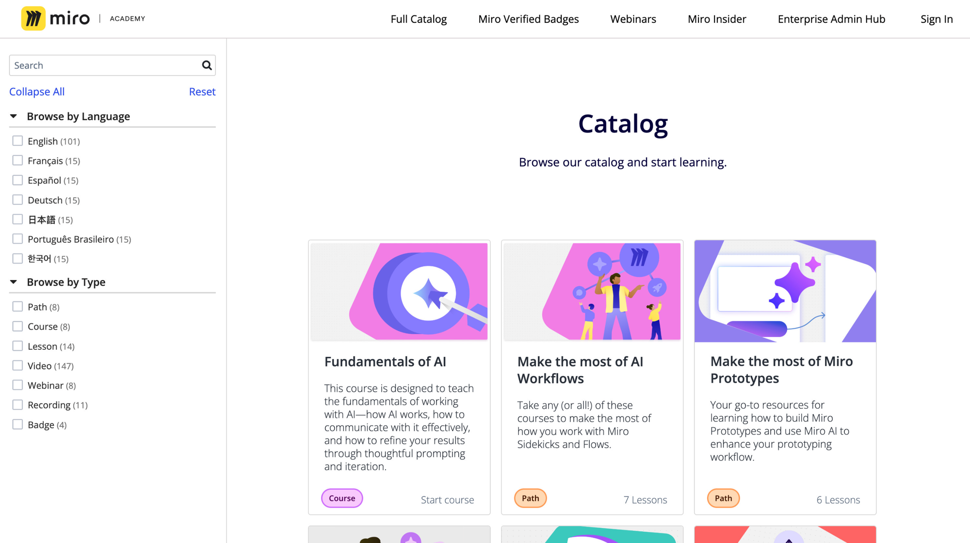
- the Learning Center: accessible from inside the product, with curated tutorials sorted by use case (workshops, planning, brainstorming, etc.) — so users find what's relevant to their job, not Miro's feature list
- the Help Center: for searching specific questions, with answers in multiple formats (articles, videos, FAQs)
- Miro Academy: a full course library with structured learning paths, available in multiple languages, for users who want to go deeper or get certified
Each channel has its own job, but they all share the same DNA: beautifully designed, on-brand, and built around use cases and outcomes rather than features.
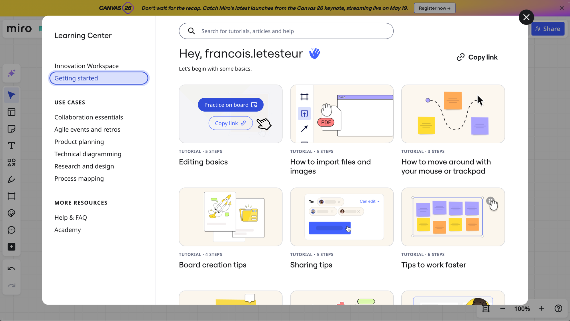
The use-case framing is the part that earns this a spot in the top 3.
Because here's the thing: when a new user opens a learning center, they're not looking for "how to use the toolbar". They're looking for "how to do the thing I came here for". Miro's content respects that. It's organized around outcomes (run a retro, plan a sprint, facilitate a workshop), which means the user finds the path to their first meaningful win much faster than if they had to translate features into use cases on their own.
It's also a great expectation-management lever. By browsing the academy, the user starts forming a clear mental model of what's possible with Miro, and what kind of work it'll let them do. That projection is what drives early adoption: belief that "this product is for me", formed from exposure to relevant outcomes.
If your product has a learning curve, learning itself should be treated as a feature. Design it like a product in the product, and most importantly, organize it around the user's use cases, not your product's structure. The user shouldn't have to figure out which feature solves their problem. Show them the outcome first, the feature second, as the means to the goal.
What to take from this
You can tell the Miro team does not treat onboarding like a vague afterthought.
Yes, I actually was a bit disappointed to not see a few things I was expecting from such a mature product/team, like:
- welcoming the user when they land in the product
- surfacing the Learning Center on first product entry
- or even adapting the onboarding question flow based on user answers, to remove/delay unnecessary/marketing questions and reduce time to product entry
But the way they designed signup, onboarding form and guiding resources shows they premium design thinking quality. Signing up and getting inside the product is actually flawless, and they know what kind of user they're mostly targetting: people who already know how it works.
The rest is in how the product itself is so well designed and valuable to those users.
I hope this was valuable.
PS_
Want me to review your onboarding for $0? Apply here.
I'll share a Miro board with screen-by-screen annotations and top recommendations I'd work on first, and why. I'll look at it through both a strategic, user psychology and UX lens, based on the same system I use with clients.
(No commitment, no following harassment with a drip email campaign or whatever)
Senior Product Designer • Activation/Onboarding Specialist
Helping B2B SaaS founders activate, convert and retain more users
Let's talk → LinkedIn | fsimitchiev.com