
Why your website is failing people who actually wanted to signup

When the right visitor lands on our page, 2 unconscious filters decide whether they sign up or leave. The first is TAM (Technology Acceptance Model): does this look useful, and does it look usable? That's the rational layer (your headline, value prop, features, proof). Most SaaS websites are built almost entirely around this.
The second filter is TERA, a neurological threat assessment the brain runs automatically as the visitor gets closer to the decision. Tribe, Expectation, Rank, Autonomy. If any of these signals feel off, the brain reads the situation as risky and the visitor leaves, even if they wanted what we were offering.
The sequence matters: TAM fires first (at the headline), TERA fires second (near the commitment). Fail TAM and you'll see it in your bounce rate. Fail TERA and you'll see it in your conversion rate: engaged visitors who read everything and still didn't sign up.
This post breaks down both frameworks and gives you a practical checklist to audit your own page through both filters.
We often look at a flat conversion rate and think: wrong traffic, wrong message, wrong offer.
Sometimes that's true. But if we're confident in building the right product for the right people, then the problem is more subtle (and more fixable). It's happening in the journey between "this looks interesting" and "ok, I'm in".
So if we're attracting the right traffic (the people who really benefit from our product), and offering the right product that will unlock them in achieving their goals (or make it much less painful than the current option they're using), what's left is maybe the wrong messaging on our website.
Messaging specialists like Clémence Lepers will tell us we need our visitors to instantly know:
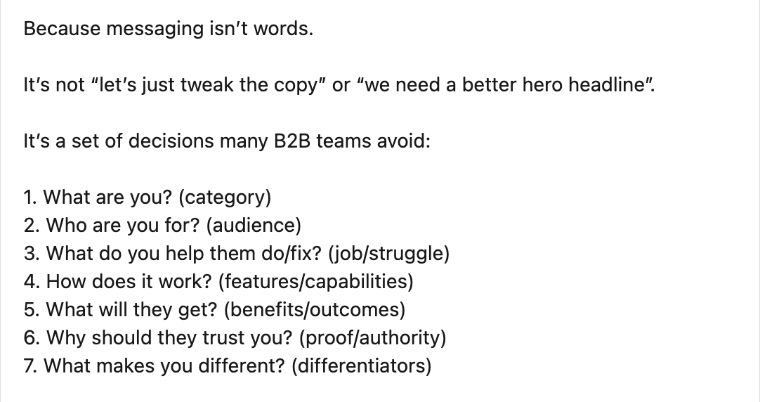
Now I fully agree with this (it just makes so much sense) and the way I see it, there are 2 categories of components on a website:
- persuasion builders
- conversion drivers
and the list above feels incomplete. To persuade and convert requires not only to provide relevant information (logic), but also to create the right psycho-logical conditions for the user to sign up. Because as behavioral research shows, we humans decide and act based on our emotions, and only rationalise afterward.
So let's look at persuasion and conversion from a psychological/behavioral lens.
The 2 psychological filters users unconsciously run your website through
Filter #1: does this look worth it?
Our visitor didn't land on our page cold. Something brought them here (an ad, a recommendation, a search result). They already have a hypothesis: "this might be for me".
The headline either confirms that hypothesis or kills it.
This is the territory of the Technology Acceptance Model (TAM), a framework from behavioral research that identifies the 2 core questions every potential user is asking in their mind:
- perceived usefulness: will this actually make my situation better?
- perceived ease of use: can I figure this out without it becoming a chore?
Our hero section, value prop, feature breakdown, case studies... all of it is TAM. We're answering: "yes, this is worth your time, and yes, you can actually use it easily."
Most SaaS websites are built almost entirely around TAM. And that's not wrong. If we fail TAM, nothing else matters:
- "this is not for me" -> they bounce
- "it feels difficult to use" -> they bounce
But passing TAM isn't enough to earn the signup.
Filter #2: does this feel safe?
Here's what happens when TAM works. The visitor thinks: "ok, this looks relevant." So they keep scrolling and get closer to the decision.
And that's when a second, quieter evaluation kicks in.
It's not rational but neurological. Before the brain commits to anything (clicking a button, entering an email, starting a trial) it runs a threat assessment. This comes from ancient times where survival was at stake every minute.
Researchers call this the TERA framework. 4 signals the brain scans for to determine whether a situation is safe or risky:
- tribe: "are you with me, or against me?" Does this product feel like it was built for someone like me specifically, or for everyone in general, which is code for no one? Generic copy tanks tribe, and so does social proof that features no one your visitor would recognize as a peer or identify with.
- expectation: "do I know what happens next?" What actually happens after I click "Start free trial"? Will there be a credit card ask? How long until I see something useful/meaningful? Ambiguity = risk. The brain doesn't like open loops, especially near a commitment.
- rank: "Do I feel capable here, or out of my depth?" Jargon-heavy messaging, confusing pricing, copy that assumes expertise the visitor doesn't have all signal "maybe this isn't for me."
- autonomy: "Do I have a choice, or am I being sold to?" "No credit card required" is an autonomy signal. A free trial is an autonomy signal. An aggressive chatbot that fires four seconds after arrival is the complete opposite. The more the visitor feels like they're choosing rather than being pushed, the safer the decision feels.
TERA failure is invisible. Nobody bounces loudly. They just leave, even when they wanted what you were offering.
The only reason they would still sign up is because they're literally blocked in achieving their goal, and your product is the only solution available on the market... but is it?
The sequence that actually matters
TAM and TERA aren't competing frameworks. They're sequential filters.
Filter 1 (TAM): is this worth my attention? Triggered by the headline. Answered by your value prop, features, proof of results.
Filter 2 (TERA): is it safe to act and take next step? Triggered as the visitor moves toward the decision. Answered by specificity, clarity, low-friction CTAs, objection/friction removers and copy that makes them feel seen.
Fail filter 1 and they leave immediately. You'll see it in your bounce rate.
Fail filter 2 and they leave after reading. You'll see it in your conversion rate (and wonder why engaged visitors aren't signing up).
That's your TERA leak.
Run your page through both filters
Filter 1 — TAM
Perceived usefulness
- is the outcome you deliver specific and believable, or generic and vague?
- do you show results and articulate benefits/outcomes, not just features?
- is there proof that matches your reader's situation closely (not just logos, but also context?)
Perceived ease of use
- is time-to-value communicated explicitly?
- do you show the product before the signup wall?
- does "getting started" feel like a small step or a commitment?
Filter 2 — TERA
Tribe
- does your copy name a specific person, or describe a generic use case?
- do your testimonials feature people your ICP would recognize as peers?
- does your tone sound like a peer talking, or a vendor pitching?
Expectation
- is it clear what signing up actually means (what happens immediately after the click?)
- do you address the implicit anxieties: credit card, setup time, onboarding complexity?
- is your onboarding flow previewed anywhere before the commitment?
Rank
- does your copy talk at the visitor or with them?
- can visitors access pricing without having to request it?
- do you lead with their problem, or with your product?
Autonomy
- is the primary CTA a low-commitment action (free trial, sandbox, interactive demo)?
- does "no credit card required" appear near the CTA if it's true?
- can visitors explore before being asked for anything?
Most conversion work happens in filter 1. Better headlines, clearer value props, stronger case studies. All useful.
But if your visitors are reading and still not signing up, the problem is almost certainly filter 2.
Run the TERA check. The leak is probably there.
Hope this is valuable (and that you'll glow tonight when you share that insight about our brain scanning our environment 5. times. per. second!)
Senior Product Designer • Activation/Onboarding Specialist
Helping B2B SaaS founders activate, convert and retain more users
Let's talk → LinkedIn | fsimitchiev.com