
[🔬 onboarding dissection] Gamma top 3 activation moves

What is Gamma?
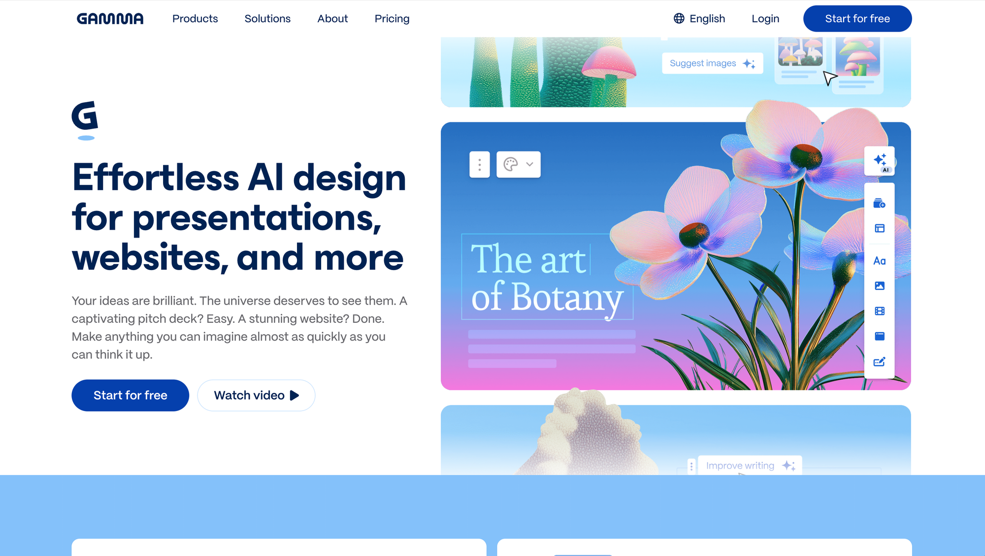
Gamma is an AI-powered presentation builder. The promise: go from a prompt to a polished, shareable deck in minutes, without wrestling with slide layouts, fonts or design choices.
I've been reviewing B2B SaaS onboardings for a while now, and Gamma's is one of the most well executed PLG onboardings I've seen. User success-driven, thoughtful, tight, and optimized for engagement and momentum right from the first click.
The product is also super well crafted, and the team has made the effort of putting a few delighters to make signup a breeze and spark positive emotions.
Here are the top 3 things Gamma's onboarding does really well (as always, imho).
TOP 1 — The AI generation moment stacks 4 micro win celebrations in 60 seconds
Most onboardings, if they're lucky, deliver one emotional peak. That moment where the user thinks "okay, this is actually kind of great." This is what i call the first meaningful win.
Gamma engineers 4 emotional hits in a row.
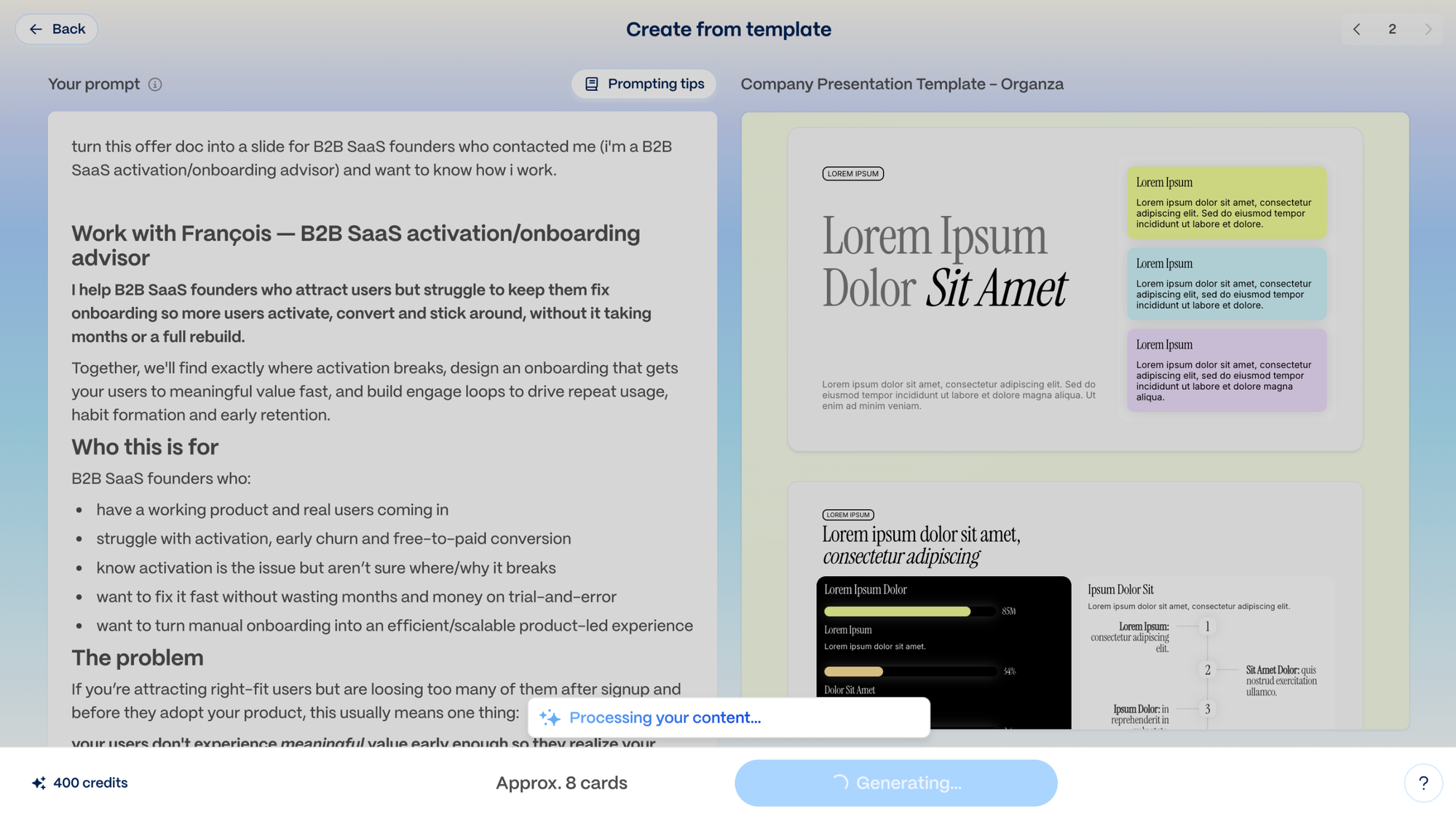
You type a prompt. And then:
1/ the system shows you the work in progress
Tasks completed by the system appear on screen as they happen. "Generating structure... finding images... applying theme..." This is the labor illusion at play: waiting times feel shorter (while the output feels more valuable) when the user can see the work being done. It also builds perceived competence: a system that shows its reasoning feels more capable than a black box. It's exciting!
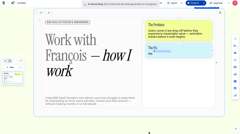
2/ you watch the presentation build itself, slide by slide
Not a spinner or a progress bar, but the actual slides materializing in real time. This activates anticipatory reward (the same mechanism behind loading animations done well). The user isn't waiting, they're witnessing creation.
3/ a micro-celebration at completion
Small, warm, well-placed. Not one that feels bland (using confetti for the sake of using confetti — please can we get pass that and get more creative?) but a genuine micro-celebration with just enough to create as a tiny emotional peak, not more.

4/ the reveal with the preview mode
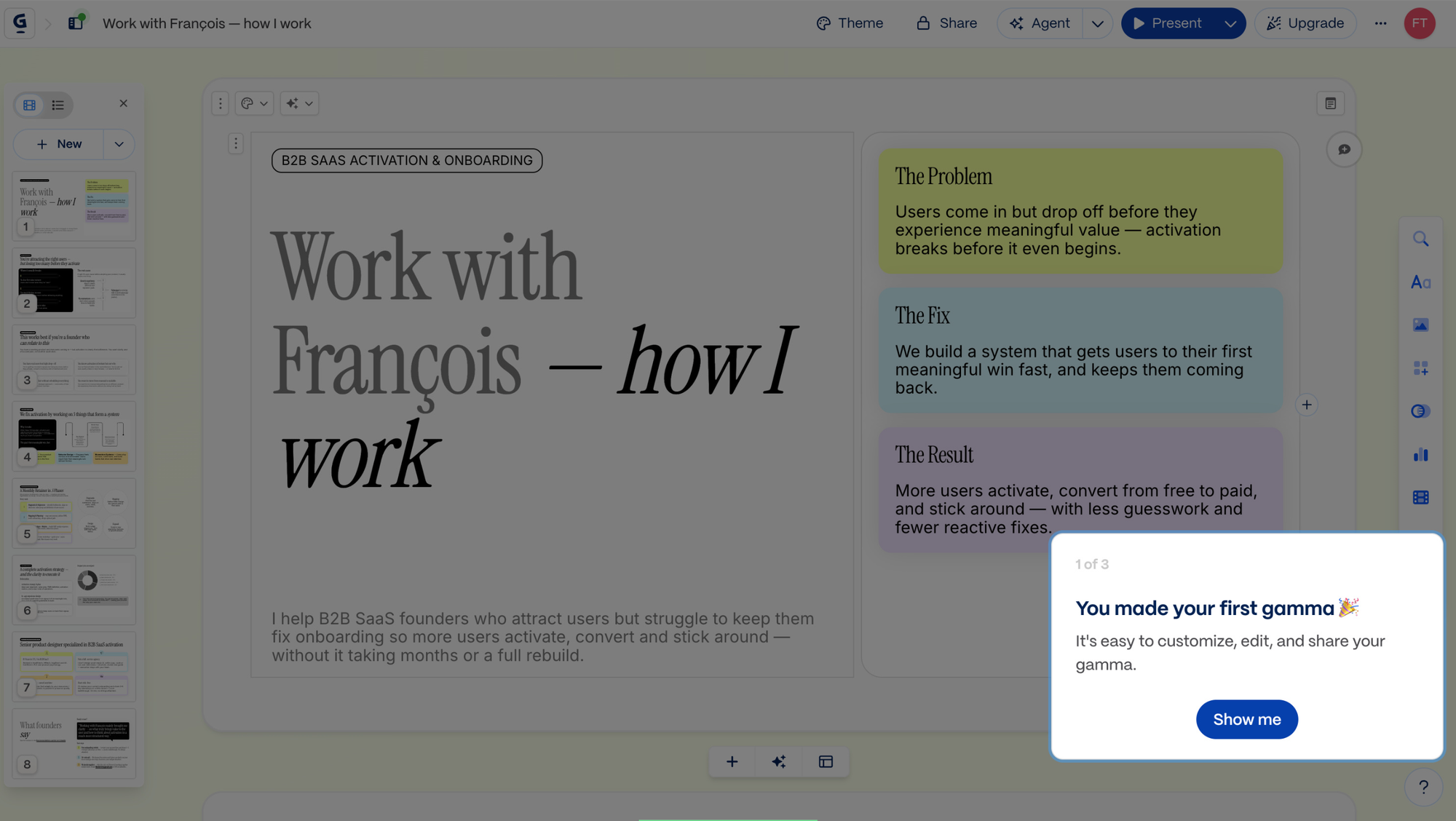
Subtle animations as each element enters the screen and presentation that feels alive and genuinely looks good (even sexy actually). This is the big peak, the WOW moment, the first meaningful win that anchors the whole onboarding as a positive memory with a happy ending a promised value actually delivered. You built a sexy prez in no time. You feel empowered and you just saved so much time!
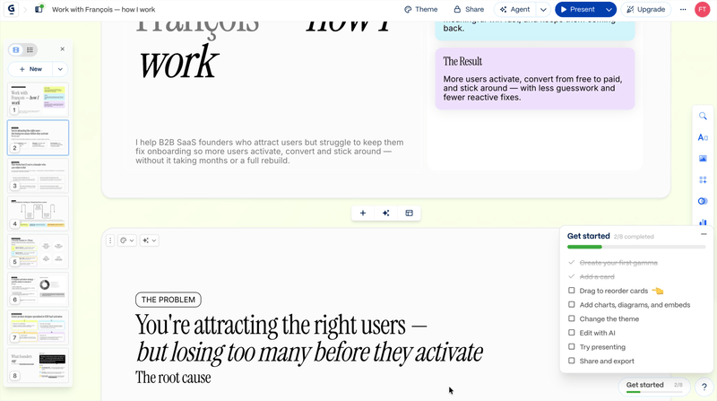
4 emotional peaks, all building toward the first meaningful win, and all contributing to creating positive emotions and associations with the product, making users much more prone to come back for more after their first win.
This is the Peak-End Rule applied at scale. People judge experiences disproportionately by their emotional peaks and by how they end. Gamma doesn't hope to land one peak; it engineers a sequence of them, culminating exactly at the moment the user will be deciding whether this product is worth coming back to... or not.
This is what users will remember. This is what they'll tell friends about (I actually did myself a few moments after trying Gamma).
TOP 2 — There's NO moment where the user is left on their own
This is the one that impressed me most after the full walkthrough.
In most onboardings I see, there's always a moment. A screen where the UI or the copy is confusing, a dashboard that greets the user with 14 features and no hierarchy. A moment where momentum breaks because the product stopped holding the user's hand for a second too long, hoping they'll figure out what to do on their own (some do, some don't and those risk joining the 40-60% of users who won't give your product a second chance. source: ProductLed).
Gamma doesn't have that moment.
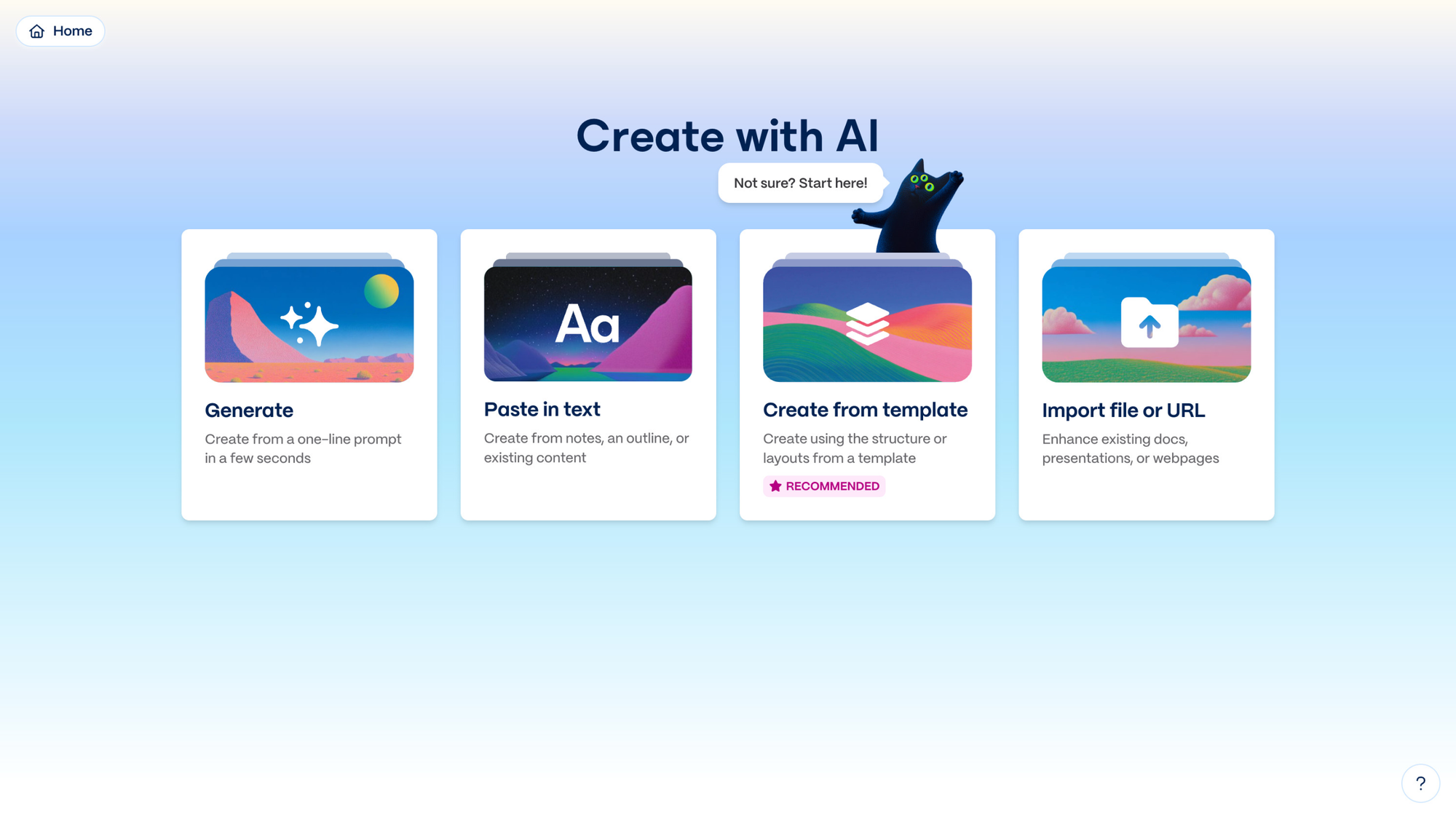
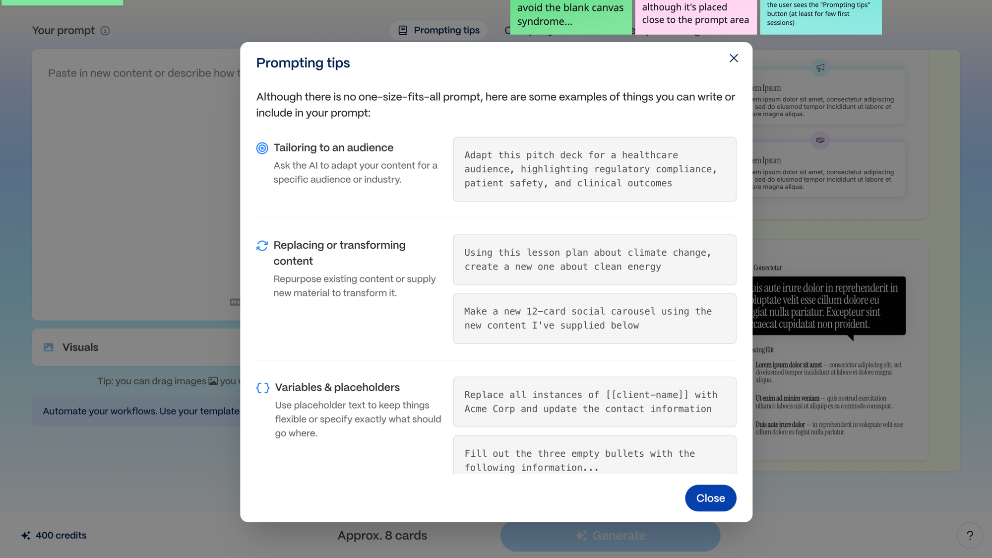
Every step has guidance, every decision has a recommended path, and every screen knows what it's asking (and it's only one thing). The setup flow has progressive explanations. The use case selection has a cat saying "Start here!" and a "recommended" tag to avoid decision paralysis. The prompt screen has prompting tips to avoid the blank canvas syndrome (the button to see those could be more visible tho, at least for the first sessions). The tutorial is 3 quick, well-explained slides. The dashboard offers tips and tricks packaged as a gamma prez. The AI editor has a conversational tone that makes the tool feel collaborative rather than intimidating, and it provides relevant responses and suggestions.
This connects to something deeper than any single principle. It's cognitive load management at the level of the entire journey. New users don't have energy for figuring things out, especially in B2B. They're busy. And every micro-decision they have to make draws from the same finite motivation tank that brought them into the product.
By making every next step obvious, Gamma keeps that motivation intact all the way through to the first meaningful win.
Gamma really gets what the first-run experience is about: taking the user to a first moment of meaningful value realization, as quick and easily as possible.
TOP 3 — The credits system turns the freemium limit into a driver of exploration, not a wall
A major risk with free tiers I often observe: treat them as a gated demo with a countdown. A teaser designed to frustrate users into paying.
Gamma treats it as a budget for discovery, early user success and habit formation.
400 credits granted upfront. A clear explainer of what credits are and what they buy. A visible balance throughout the experience. Upgrade prompts framed around what the user gains, not what they pay.
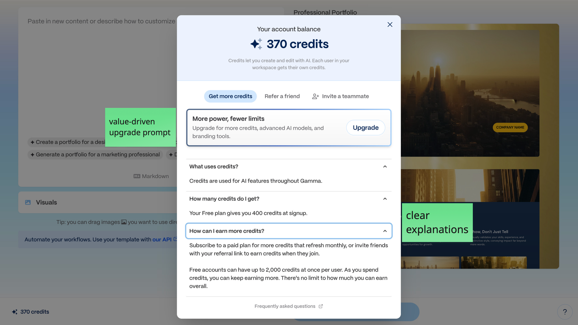
The free tier doesn't limit engagement, it structures it. Users spend credits experimenting, hit the moments where they want more, and the upgrade arrives as a logical next step rather than a gate. By the moment they'll have to upgrade, it will be to be able to keep using the product, to keep winning with it.
This is the give before ask principle and it's the opposite of the common PLG trap where the free tier is designed to annoy users into paying. Gamma's credits are designed to make users feel it's generous toward them, and lets them play and win without the need to worry about paying. Which is a much better emotional state for a conversion, don't you think?
A quick word on what could be even better
No onboarding is perfect, and Gamma's has a few small fixes that could have a significant impact on activation and retention.
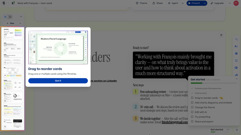
The "Get Started" checklist ticks items when the user views the tutorial slide, not when they actually do the action.
This breaks the core contract of a checklist: real progress for real behavior. Users lose the dopamine hit of genuine completion. Fix: validate on actual completion. Add a micro-celebration. Turn a currently hollow mechanic into one of the strongest retention drivers in the product: learning by doing and experiencing the joy of small wins.
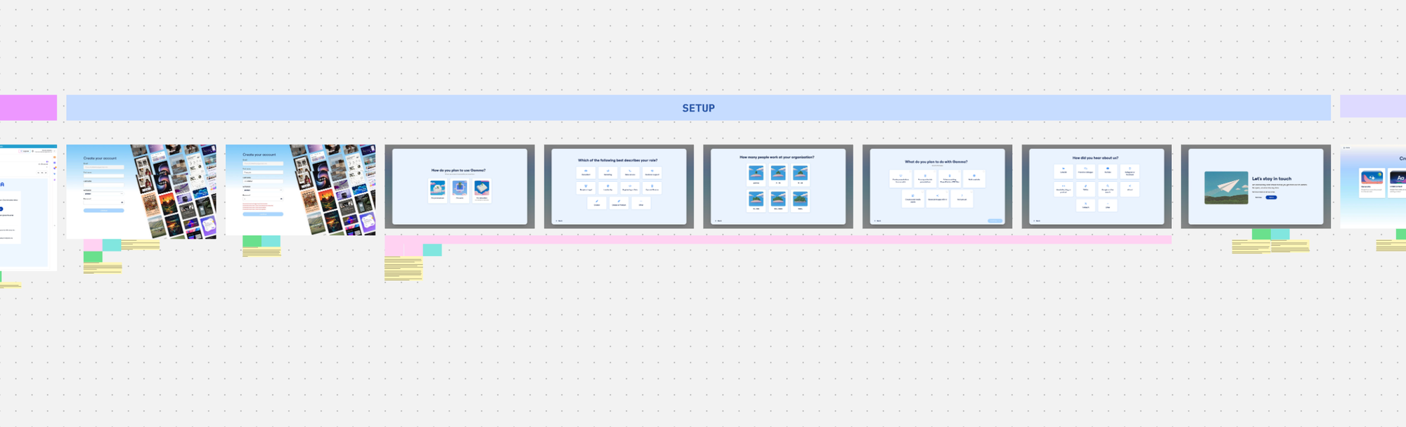
The onboarding questions don't visibly personalize anything.
The screen literally says "we use your answers to personalize your experience" and then serves every user the same template library with the same recommendations. The user feels it even if they can't articulate it. Fix: either actually use the answers (pre-filter templates, adjust the recommended path) or delay the questions until after the first meaningful win, when the user is motivated to invest in a product they trust.
Removing those 5 questions from the setup phase of the onboarding flow would reduce it by 37,5%. (from 8 screens to 3)
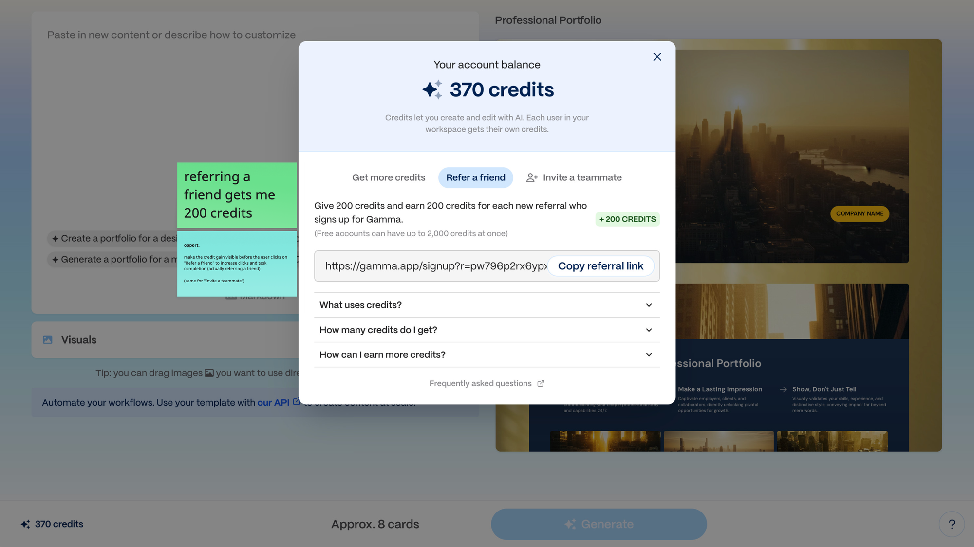
The "Refer a friend" incentive is hidden behind a click.
The 200-credit reward only appears after the user clicks the referral button, which means the incentive doesn't exist in the user's decision to click in the first place. Same for "Invite a teammate." Fix: put the reward on the button. "Refer a friend → +200 credits." Zero-cost change, meaningful impact (I'm taking the bet).
Closing thoughts
What makes Gamma's onboarding stand out isn't any single clever move. It's the coherence of the whole thing.
Every screen knows what it's asking. Every step has a next step. Every moment of effort is matched with a moment of reward. The product never forgets the user is a human being spending finite motivation and time on yet another new tool to learn, and its designed around that.
I could really tell the team at Gamma understands PLG strategy, user psychology and smart UX. But most importantly, I could really tell they seem to genuinely care about building a great, valuable product, and make their users succeed with it.
From a revenue pov, Gamma as (imho) a very smart PLG strategy.
Not only do they focus on letting users experience meaningful value and build habits with their tool, but they also built a smart referral system and virality mechanism (invite teammates to collaborate), with aligned incentives: get more credits to play.
I say bravo. 👏
Or brilliant. ✨
I hope this was valuable.
PS_
Want me to review your onboarding for $0? Apply here.
I'll share a miro board with screen-by-screen annotations and top recommendations I'd work on first, and why. I'll look at it through both a strategic, user psychology and UX lens, based on the same system I use with clients.
(No commitment, no following harassment with a drip email campaign or whatever)
Senior Product Designer • Activation/Onboarding Specialist
Helping B2B SaaS founders activate, convert and retain more users
Let's talk → LinkedIn | fsimitchiev.com