
[🔬 onboarding dissection] Stripe top 3 activation moves

What is Stripe?
Stripe is... well I bet you know what it is so let's dive into it, shall we?
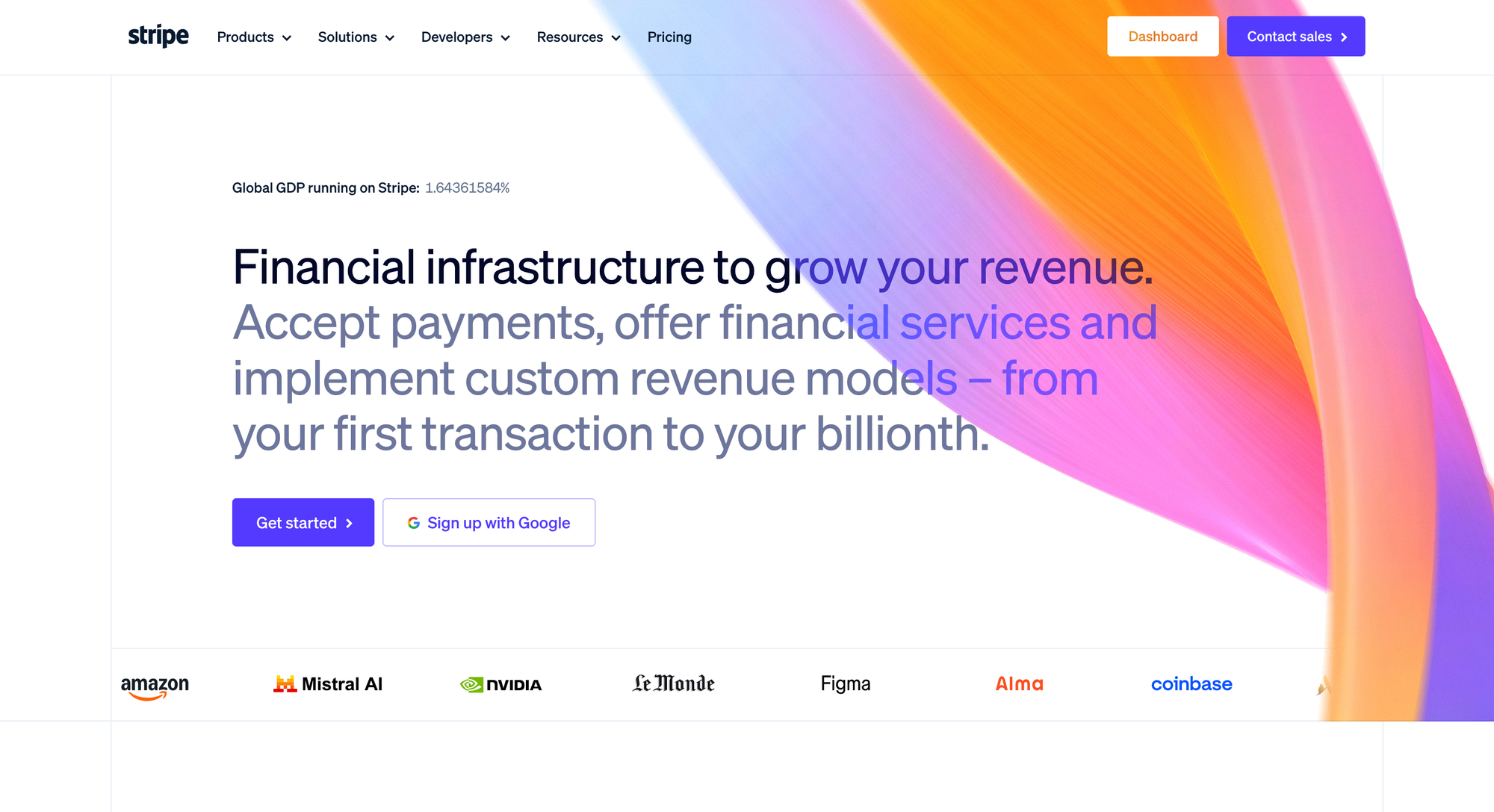
Because Stripe is so widely used, especially in the B2B SaaS space, how could I not have a look at its onboarding?
I myself use Stripe, and here's what strikes me the most about it's onboarding experience:
Stripe makes a complex thing feel easy to setup, and makes you feel safe.
Here are the 3 activation moves Stripe gets right + one bonus I think every B2B SaaS founder should steal.
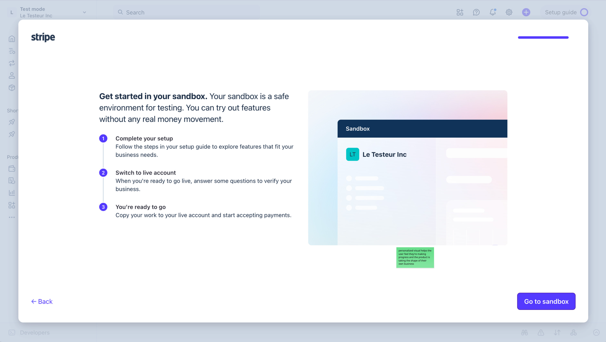
TOP 1 — A sandbox-first architecture
The whole onboarding happens in a fake environment. Real product, real interface, real setup, but no real money, no real customers and no real risk.
That's the biggest activation move for products like Stripe. Money and customer payments are a very sensitive, touchy topic. And not everyone is savvy on these things. Confusion, the fear of doing something wrong that involves a banking account or whatever scary thing can be a massive cause of activation freeze.
Stripe removes that fear. Thanks to the sandbox environment it provides by default, you can poke around and tweak everything. You can break things, you can get things wrong. The only consequence is you're actually learning the product while shaping it to your own business needs.
And then comes the master move: when you're done, one click on the Switch to live account button copies your sandbox work into production. Nothing of what you've done is wasted. No "now do it again, but for real". The work you did while feeling safe is the work you ship.
You finish setup before you ever leave the playground. And by the time the stakes of going live become real, you've already built the thing.

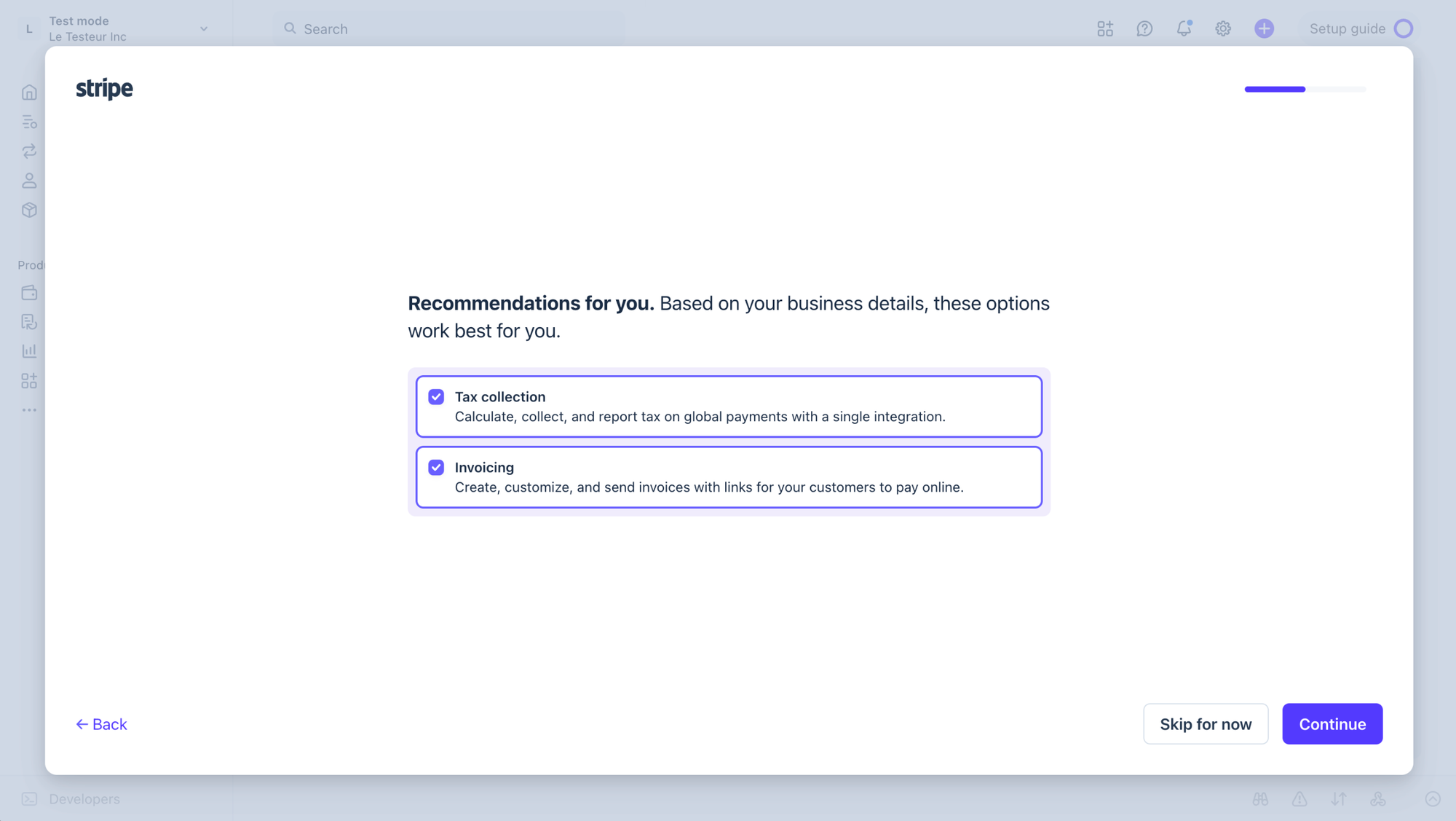
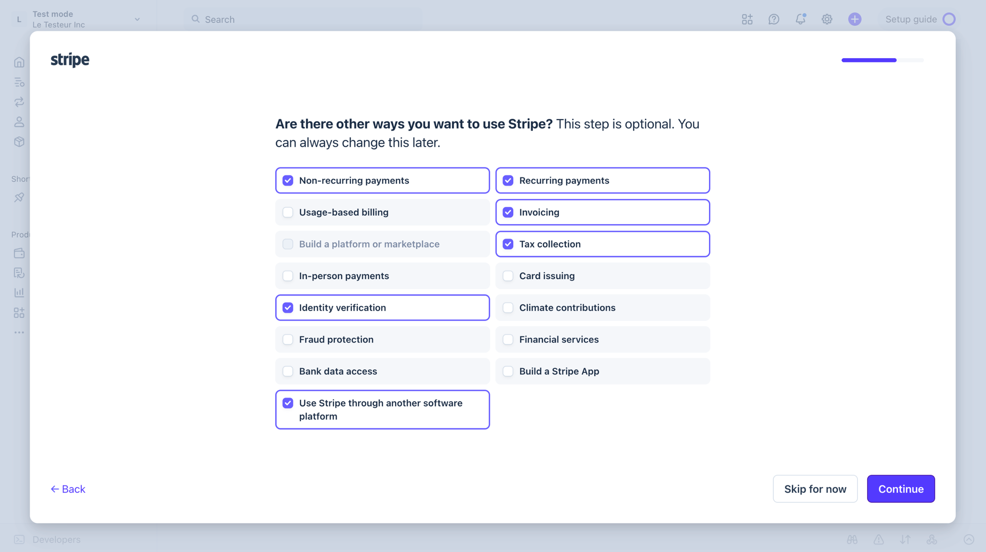
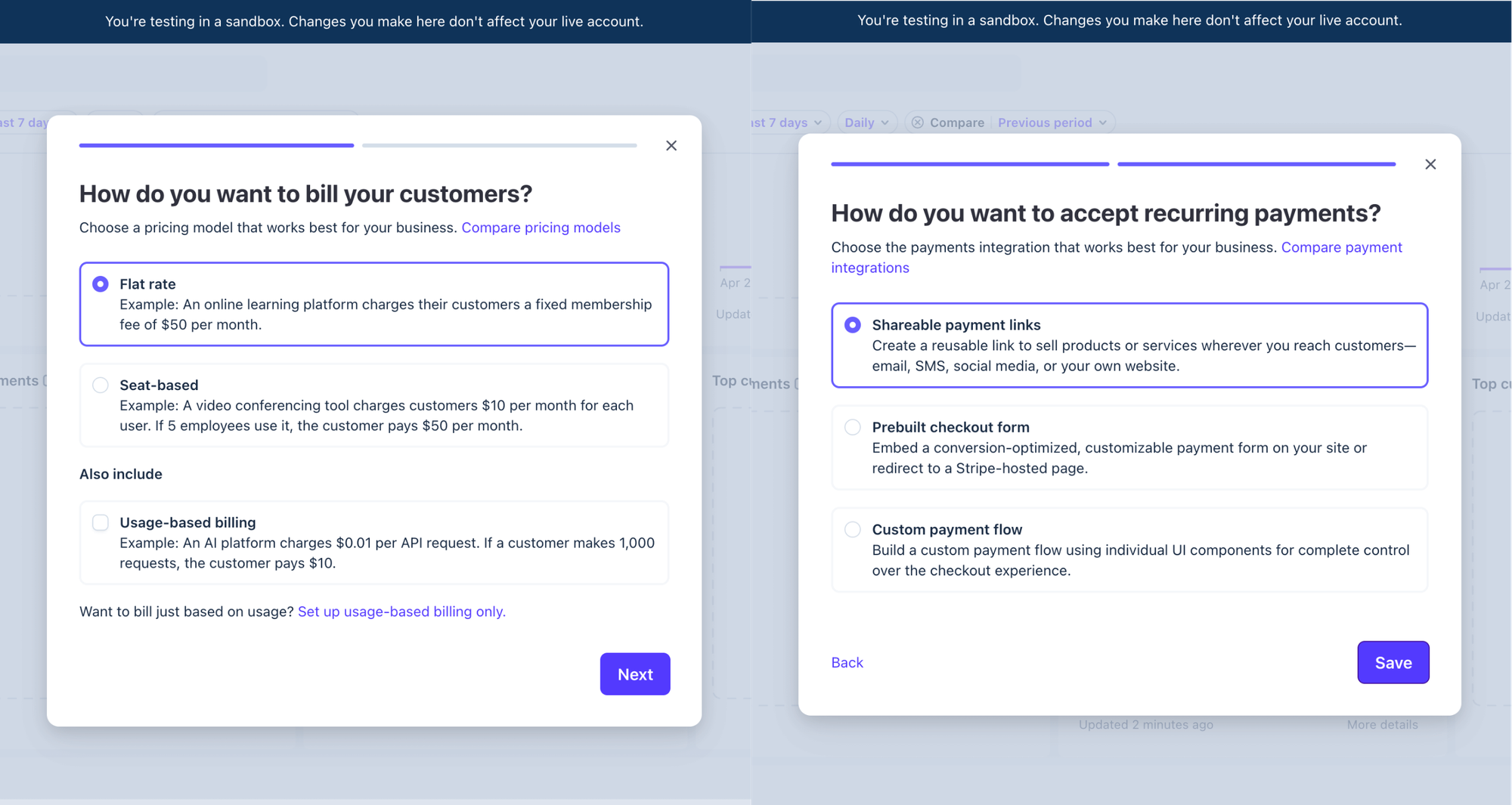
TOP 2 — A (truly) personalized onboarding
After signup, Stripe asks a few questions. Business type. Use cases. How you plan to integrate. The framing is user value-oriented here: "a few questions to get the best setup for your business". You give it info, it gives you a tailored/optimized path, removing unnecessary work on your end and shortening time to first meaningful value. Fair trade, don't you think?
If you said you don't sell subscriptions, you don't see subscription setup. The product adapts to fit your business, which is exactly what new users unconciously wish every product would do (and so little ever do).
But what it does behind the scenes is more interesting than what it asks.
Based on your answers, Stripe pre-checks the recommendations on the next screen. The dreaded configuration step (usually the highest-drop-off moment in any B2B SaaS onboarding) becomes a confirmation step. You don't set up your account. You confirm how the account already understands you.
The process is broken into just a few simple, easy-to-answer questions and takes seconds.
Also worth mentioning: the answers you provide here actually tailor what you'll see later on when landing in the product. No marketing profiling questions here, only the setup questions that 100% aim to serve the user and get them to a first meaningful win asap/as easily as possible.

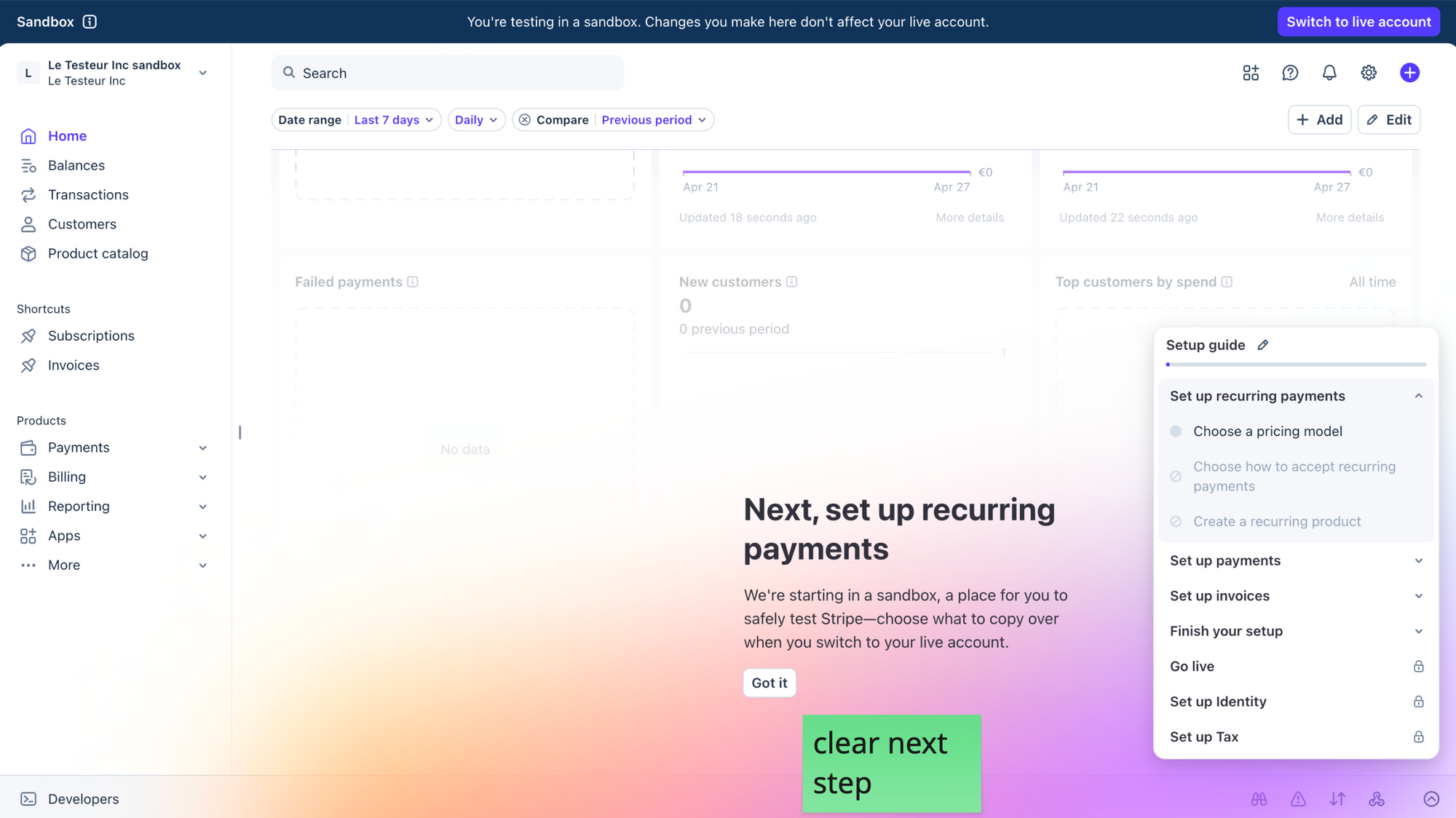
TOP 3 — A profile setup broken into a meaningful sequence of small wins
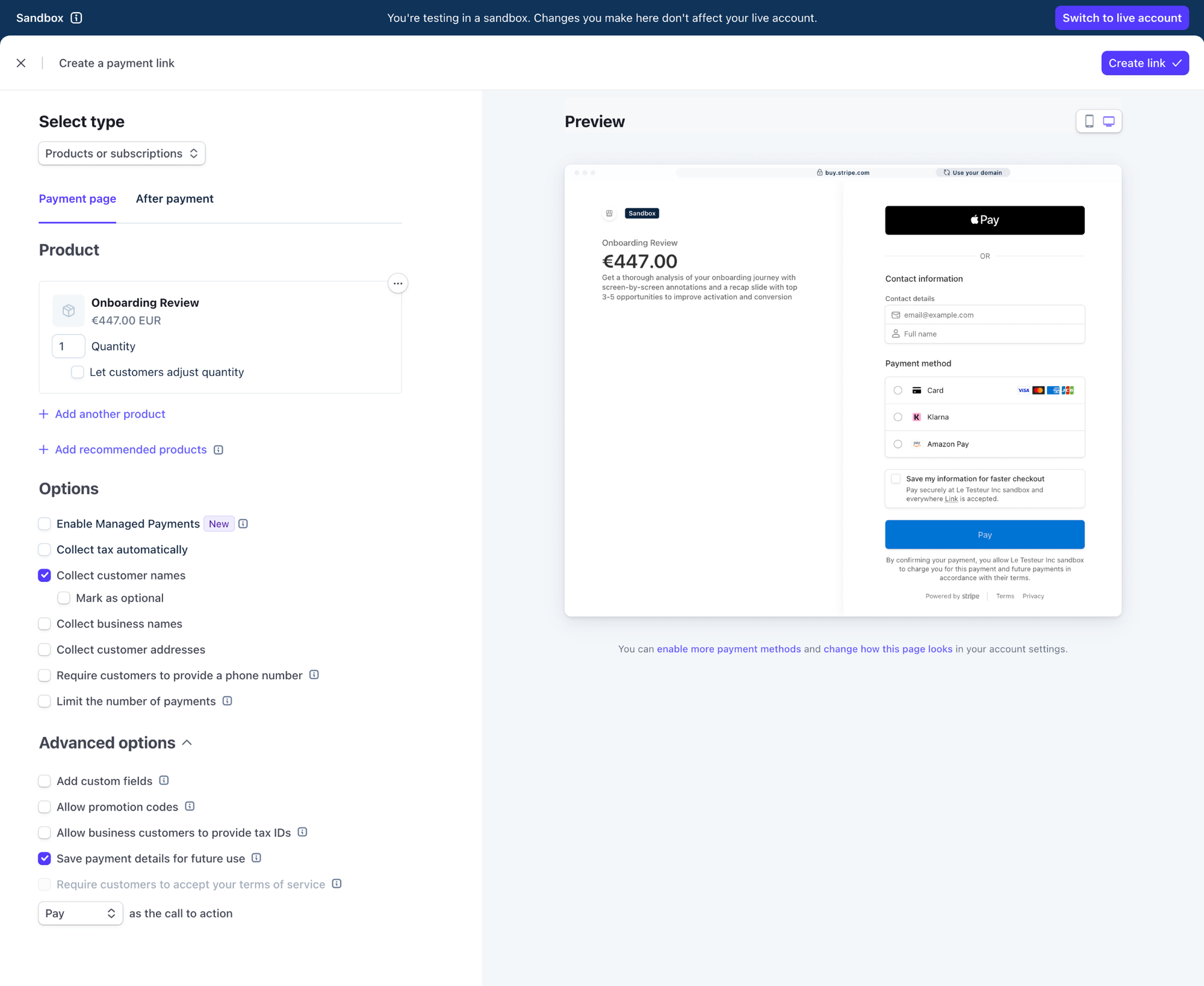
Once inside the sandbox, the profile setup isn't a giant mountain. It's a checklist, grouped by themes (payments, invoices, products) ordered in a way that actually makes sense for the user.
Each task is small, quick and easy to complete, and has a clear next step. Each task has plain-English copy and an example when relevant to help you pick the right option.
When a task is done, the checkmark appears on the Setup guide checklist, the progress bar moves forward and the home screen updates to point you at the next thing.
There's a quiet psychological system running underneath all of this. Each task opens a loop you want to close (this is the Zeigarnik effect: give someone a checklist and their brain starts wanting to finish it). Each checkmark closes a loop and opens the next one. The more tasks you complete, the more you feel you're getting close to going live (that's the goal gradient effect at play: the closer we feel we get to a goal, the more we hussle to get there).
You don't decide to keep going, you just... do. Because the onboarding constantly keeps your attention and engagement through a series of small, easy tasks. And those tasks are displayed in a way that makes you feel it makes sense to do them given your goal: be done with setting up your Stripe profile and go live so you can start making money.
Stripe's onboarding holds your hand and smoothly guides you toward reaching your 2 first meaningful wins: getting your profile set up, and going live, every step of the way.
What Stripe nailed is the atomic win (I haven't TMed this so you can reuse it, but deep down, don't forget this comes from me haha). Tasks are small enough to feel doable at once, but meaningful enough that finishing one feels like real progress. Too small and it's meaningless, too big and you bounce. Stripe seems to have found the sweet spot.
Bonus — Email verification, blocking at the moment that matters
This one deserves its own line because I witness it too rarely (almost never, actually).
Almost every SaaS I review blocks email verification at signup. Click the link before you can do anything. ProductLed actually found out companies doing this lose 10-30% of signups right there, at the entry door.*
Stripe doesn't. You sign up, you build, you explore, you set up your whole profile in the sandbox... all without verifying your email. The verification only becomes a blocker at the moment you want to go live.
By the time Stripe asks you to verify your email, you've already invested real effort. You've named your products, configured your payment flow. You've watched the product take the shape of your business. You're not going to abandon because of a mandatory email verification task right now. You're going to verify, because you've already decided this is yours.
That's the trick: the more motivated is the user (aka, the more they believe they actually need your product), the more inclined they'll be to overcome friction.
The job is not necessarily to remove all friction, but to place it where it costs the less to users.
What to take from this
The reason Stripe's onboarding works, imho, is that every step meets the user where they are emotionally.
Safety to learn, experiment and set up before go-live stakes. Personalization before configuration. Small wins before big asks. As little friction as possible before true commitment.
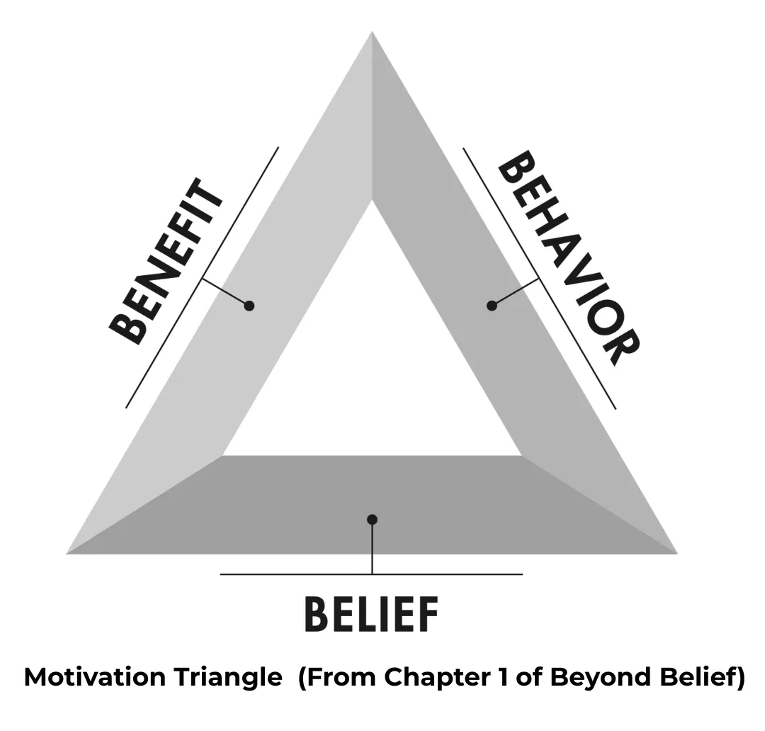
According to author Nir Eyal, user motivation has 3 core components:
- behavior (what I have to do)
- benefit (why I should do it, what's in it for me)
- belief (the conviction that the behavior will lead to the benefit)
And Stripe's onboarding focuses on having the user internally confirm all 3 as they progress, before they even go live: each task gets them closer to their final, ready-to-take-customer-money profile, and the more they progress through setup, the more they understand how Stripe will work for them and make their business... real.
If there's only ONE lesson from Stripe's onboarding,
it's that onboarding only focus should always be about getting users to feel save, build trust, and guiding users to experiencing meaningful value as early and easily as possible, without ever letting them a chance to feel doubt or confusion.
I hope this was valuable.
PS_
Want me to review your onboarding for $0? Apply here.
I'll share a miro board with screen-by-screen annotations and top recommendations I'd work on first, and why. I'll look at it through both a strategic, user psychology and UX lens, based on the same system I use with clients.
(No commitment, no following harassment with a drip email campaign or whatever)
Senior Product Designer • Activation/Onboarding Specialist
Helping B2B SaaS founders activate, convert and retain more users
Let's talk → LinkedIn | fsimitchiev.com