
[🔬 onboarding dissection] underfive.ai's top 3 activation moves

What is underfive.ai?
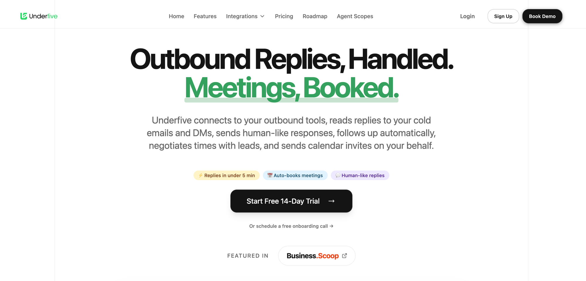
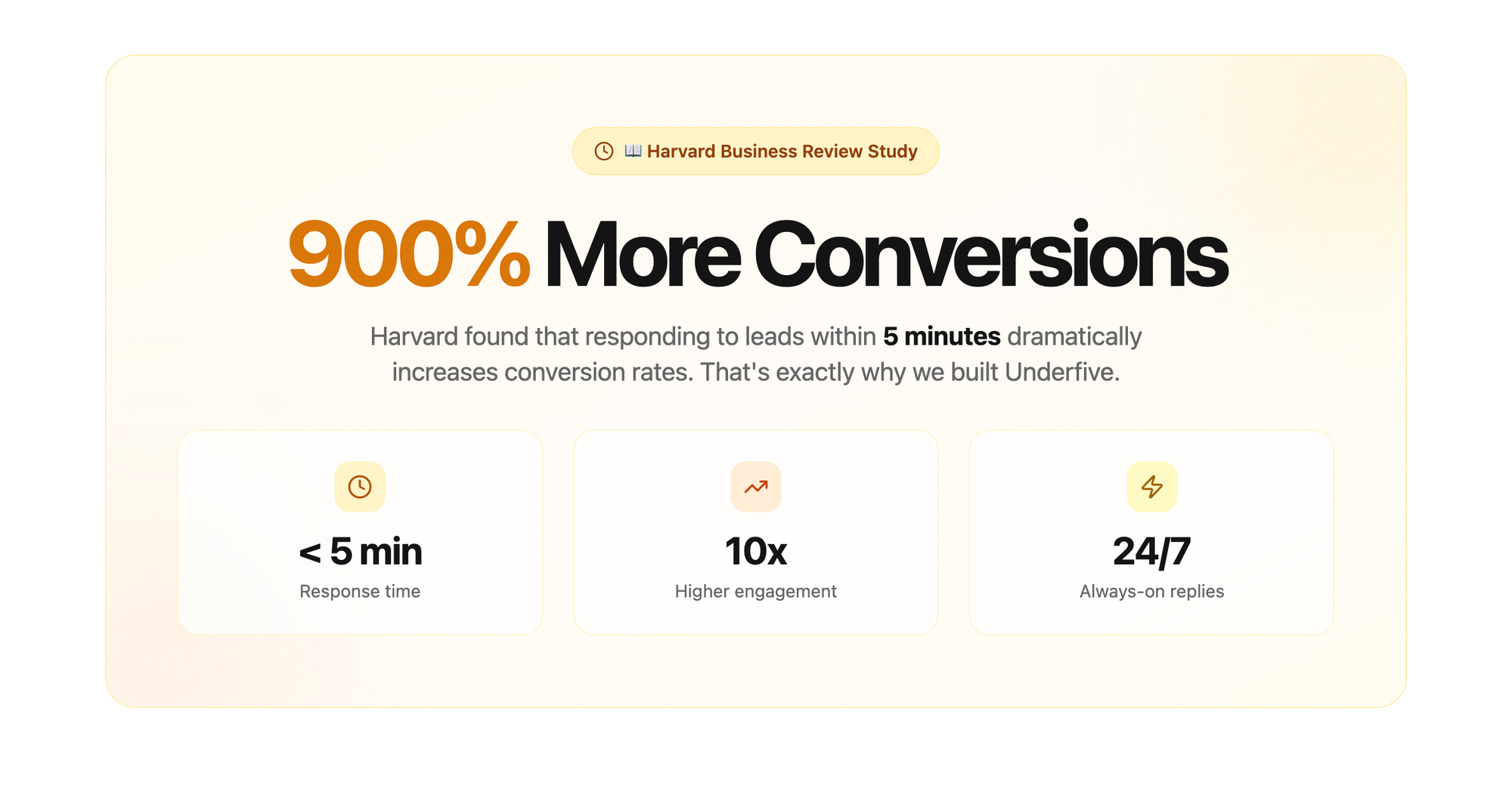
Underfive is built on the premise that responding to leads within 5 minutes increases conversions by up 900% (they cite a Harvard Business review on their website).
As I am myself flooded by leads DMing me (well it's true in my dreams), got curious about testing the tool, and — you know I eat onboarding at breakfast — seized the opportunity to review their onboarding.
Here are the TOP 3 activation moves I believe Underfive's onboarding does great:
- clear first step when user lands in product after signing up
- big setup phase broken down in smaller, easy steps
- guidance + progressive disclosure + micro wins
Let's dive in and see why those things are important.
TOP 1 — clear first step after signup
There are many, many (too many) products that, once the user has signed up and lands in the product, face them with an empty dashboard or table, and... nothing more 🤷♀️. Users are left to figure where to get started (and with what) on their own.
That's why clearly indicating what's the first step they need to take is critical. If not, we risk looking at users clicking here and there, get lost or confused, and close the tab and ciao arrivederci.
We may know how our products, but we can't possibly expect that from new users.
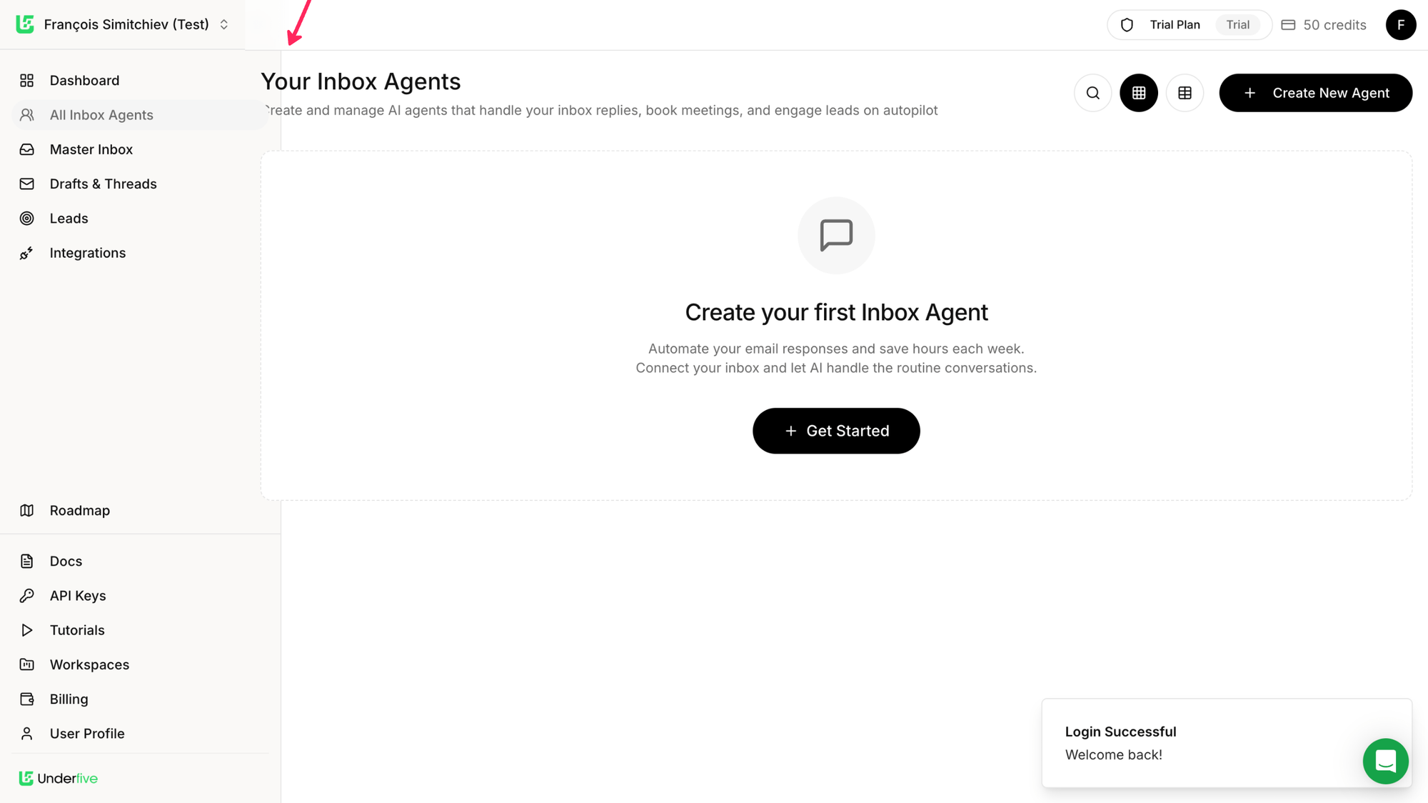
How to take this to the next level?
If the user navigates to another tab, they don't see the first step anymore. Which means they have to remember to go back to AI Inbox Agents to get started.
An opportunity here could be to make that first step always visible across the product (at least until the first agent is created).
Welcome email
Well first... there is a welcome email. Welcome emails are a great opportunity to welcome users and make a positive first impression, remind the user why they signed up (core value prop), and indicate a clear first step (and remind it in case the user signed up and left quickly after — life happens...) and reassure users by offering easy access to support/guidance.
This is exactly what Underfive's welcome email does:
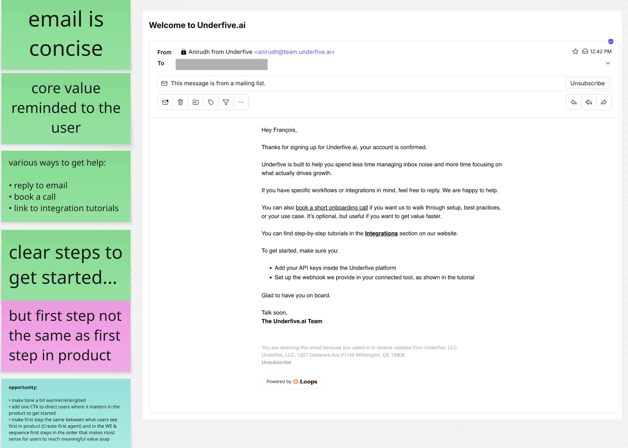
A few improvement opportunities I spotted:
- make tone a bit warmer/energized
- add one CTA to direct users where it matters in the product to get started
- make first step the same between what users see first in product (Create first agent) and in the WE & sequence first steps in the order that makes most sense for users to reach meaningful value asap
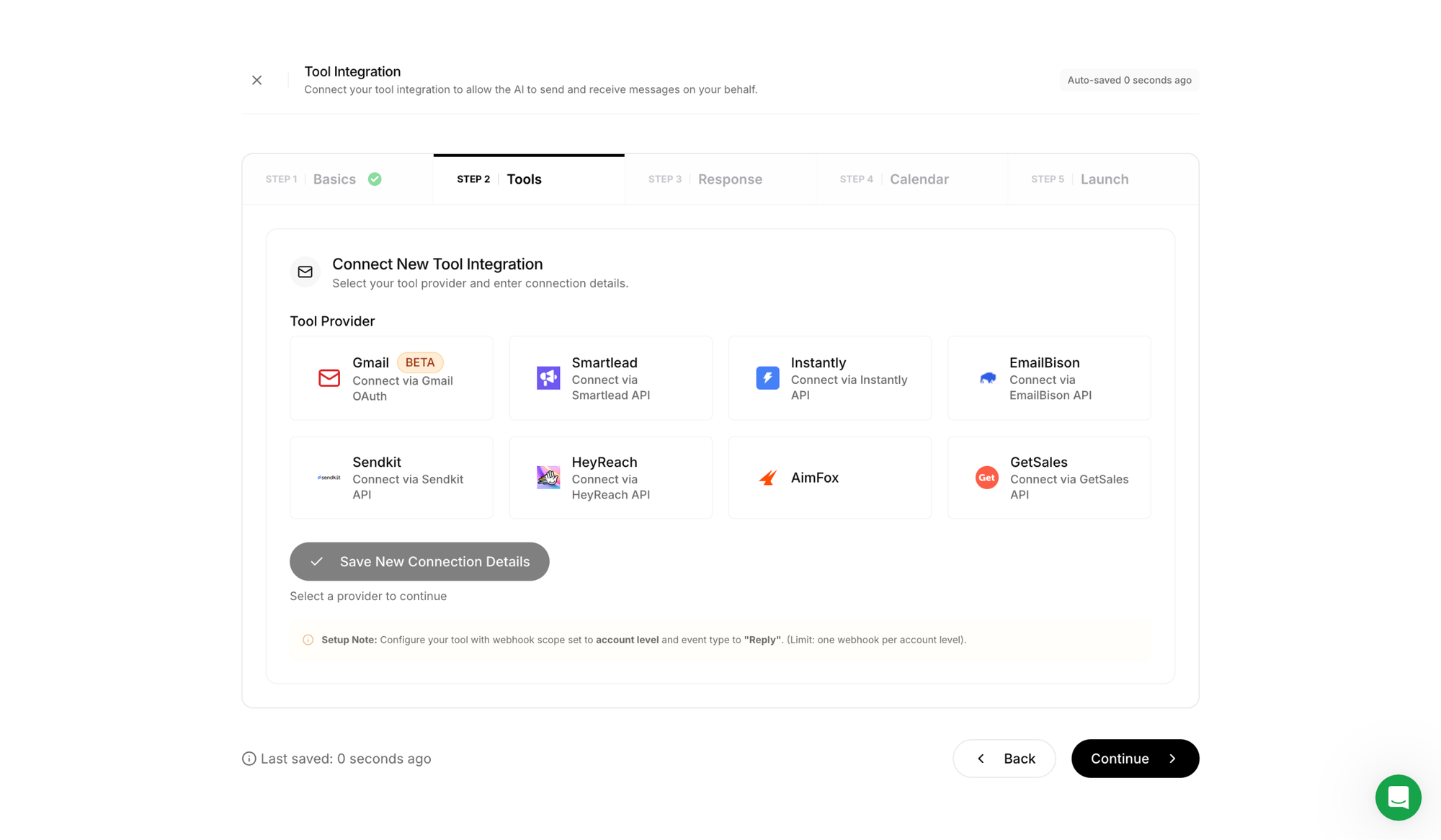
TOP 2 — big setup phase broken down in smaller, easy steps
The first task users are guided toward is creating their first inbox agent. This setup phase is critical for users to experience the value of the product.
And because they have to give effort before they see value, we need to keep their motivation higher than the friction/complexity/difficulty of the task so they stay engaged and don't drop off in the middle.
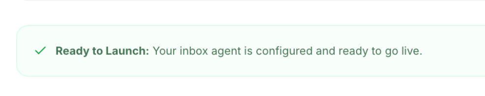
Underfive's onboarding breaks this complex task in 5 smaller milestones, and keeps the goal (launching the agent) in sight by making it the last step. Users know what they're working toward, which increases motivation (the more attainable the goal feels, the better).
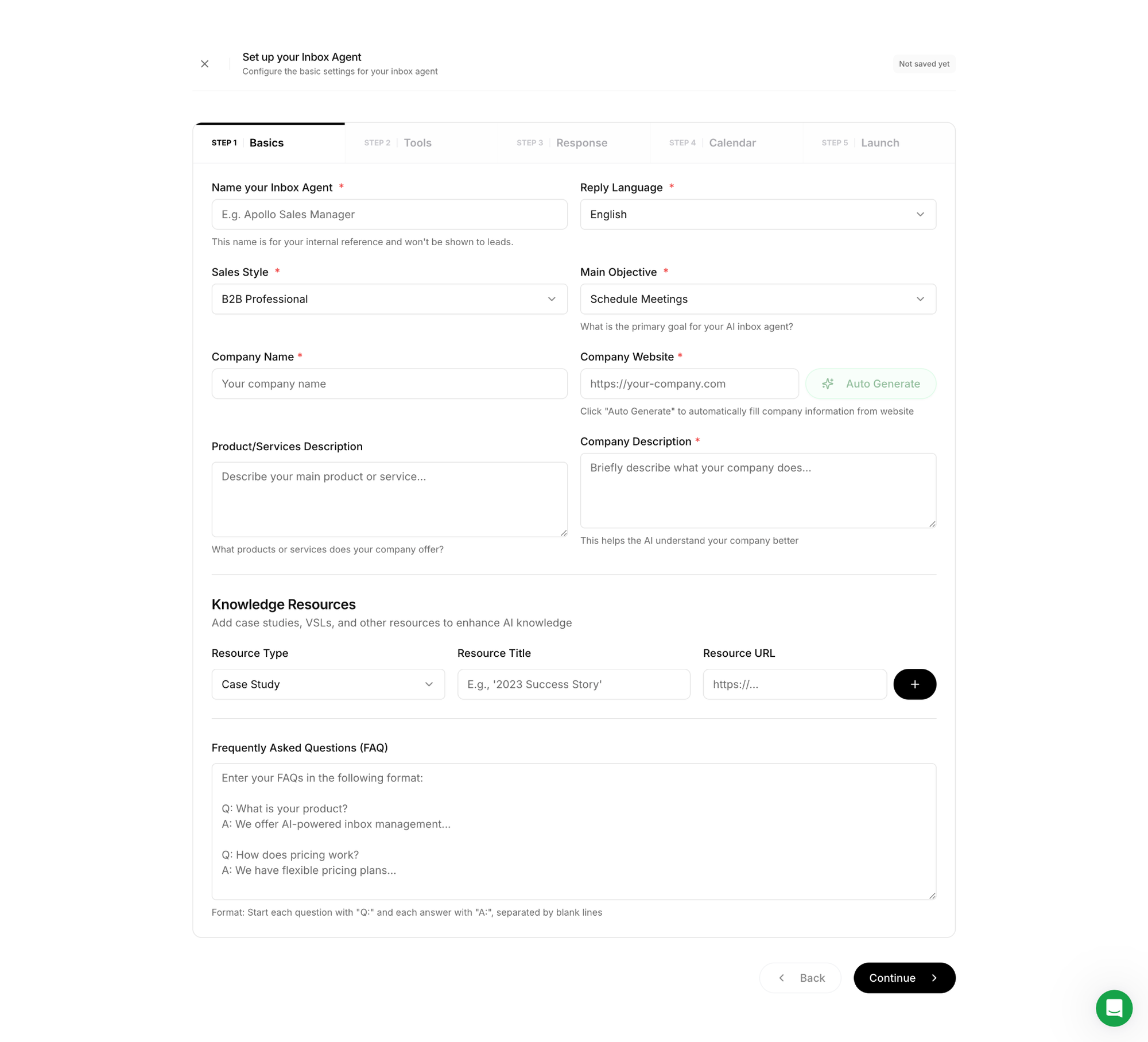
And as the user progresses, the checklist highlights steps completed to increase the feeling of progress.

And to increase the chances users keep the momentum and complete the setup phase, Underfive's onboarding does 3 more things...
Nice bonus
The UI helps the user work less and smarter by offering to automatically fill their company info from the website url they input.
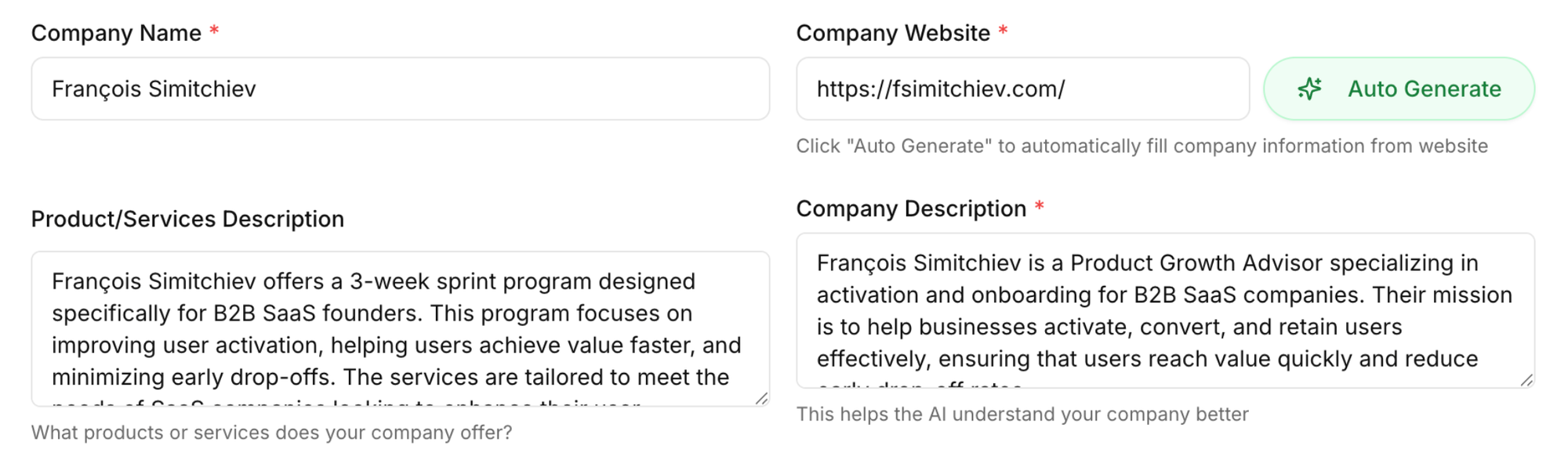
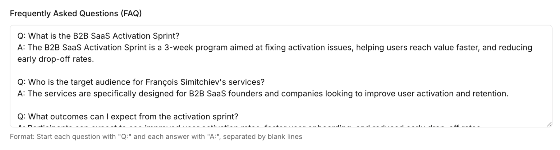
The FAQ section was also pre-filled based on that url.
Not only does the UI help the user do less and reduce cognitive load, it also acts as small delighters that spark positive emotions along the way. "Oh this is nice, they get me!". This may sound cheesy or low-impact, but it can actually go a long way in helping build trust and create positive associations with the product.
TOP 3 — guidance + progressive disclosure + micro wins
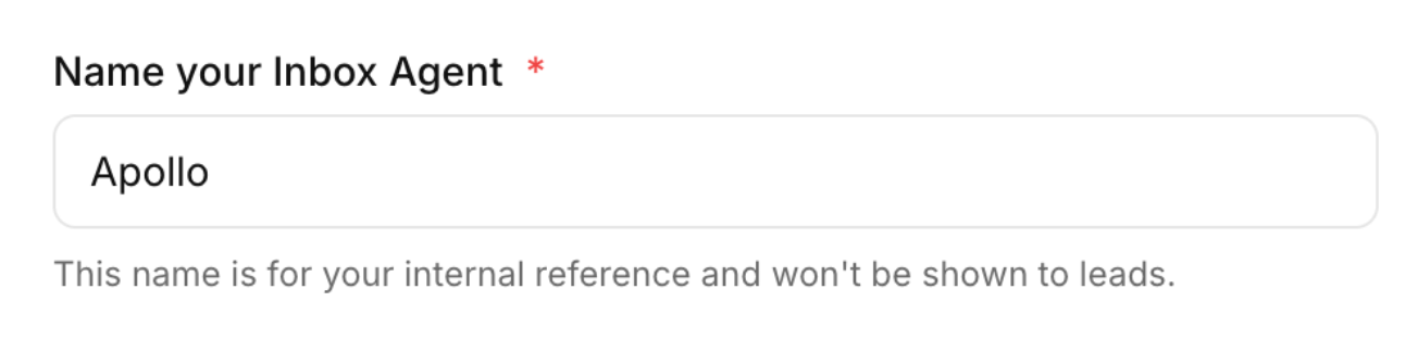
Whenever relevant, the UI adds useful info/guidance so users don't get confused. One good example is reassuring them the name they pick for their inbox agent won't be visible by leads —it's internal only.
This not only reassures users, it also builds trust and confidence.
Progressive disclosure also helps keep cognitive load minimal, which reduces the chance users will freeze and quit.
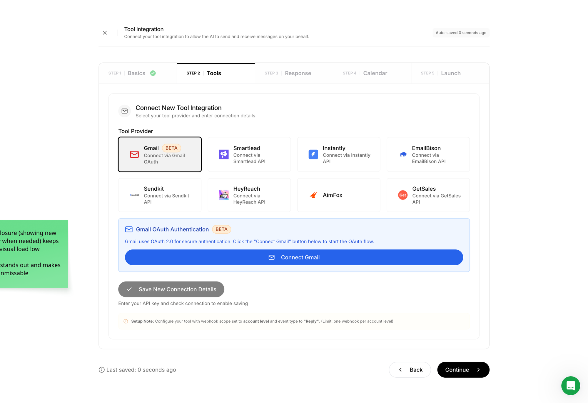
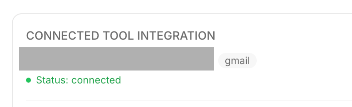
For instance, in the Connect Tool step, the UI only reveals useful info/buttons once the user has picked a tool provider. This not only avoids unnecessary visual/cognitive load before a tool has been picked, but it also helps the user focus on what's important once they do.
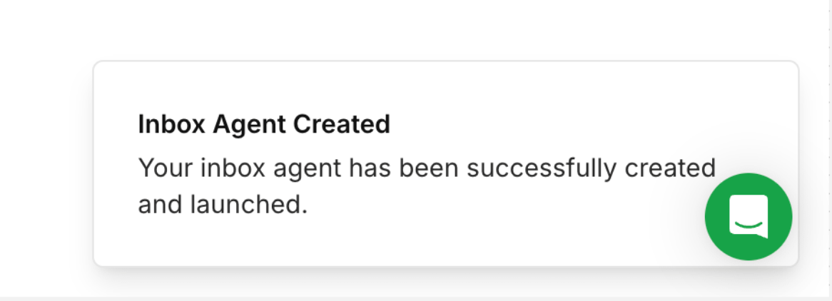
Last but not least as they say, micro-win celebrations are a great way to keep the momentum (and morale) up.
At signup, user motivation is at its highest. They're full of curiosity and hope. And the longer the setup phase before experiencing meaningful value, the more motivation will decrease.
That's why breaking complex steps into smaller ones, reducing friction and providing all the guidance users need (when they need it) to make progress and feel safe, AND celebrating small wins along the way are so important!; (yeah i know CSS, you impressed?)
Imagine running a marathon. Wouldn't it feel motivating to have friends along the way to support you and shout GO GO GO, YOU GOT THIS!
And we don't have to throw confetti every 3 clicks (that's too much cleaning). We can be subtle and take inspiration from Underfive:

Wrapping up
Underfive's onboarding doesn't do anything revolutionary, but it does a few things consistently well: it tells users exactly where to start, breaks a complex setup into digestible steps, and keeps motivation alive with guidance, smart UX, and small celebrations along the way.
Said differently, it guides, reduces friction and maintains momentum.
The common thread? Respect for the user's cognitive gauge.
Every moment of confusion, every unnecessary decision, every blank screen costs motivation. And motivation at signup is a finite resource; it only goes down from there.
So here's the one thing to take away from this dissection:
Before you add anything to your onboarding, ask: what can I remove, pre-fill, or break into smaller steps? Less friction at the right moment beats more features almost every time.
Think of a ball at the top of a hill. Your onboarding's only job is to give it that first push. Just enough to get it rolling. Every unnecessary step, every blank screen, every moment of confusion is a rock in the path. Enough rocks and the ball stops. And a ball that stops rarely starts again.
I hope this was valuable.
PS_
Want me to review your onboarding for $0? Apply here.
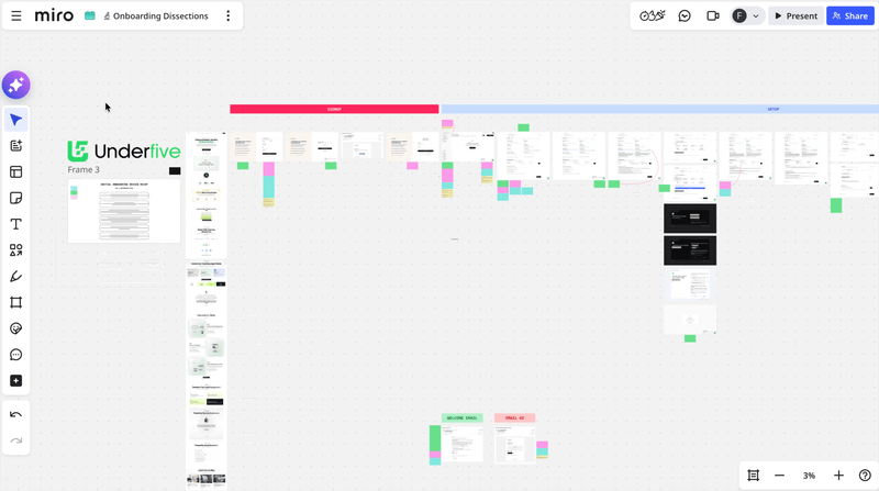
I'll share a miro board with screen-by-screen annotations and top recommendations I'd work on first, and why. I'll look at it through both a strategic, user psychology and UX lens, based on the same system I use with clients.
(No commitment, no following harassment with a drip email campaign or whatever)
Senior Product Designer • Activation/Onboarding Specialist
Helping B2B SaaS founders activate, convert and retain more users
Let's talk → LinkedIn | fsimitchiev.com