
[🔬 onboarding dissection] Tally's top 3 activation moves

Tally.so is a form builder.
It's also a brilliant example of great product-led growth execution (they reached $4M ARR in less than 4 years, with a team of 4; how amazing is that?!).
This is why I love Tally so much, and made it my default form builder: smart, small and bootstrapped team achieving great results through a super valuable and well-designed product.
Among other things they're amazing at (including acquisition and virality), they're particularly great at onboarding users and getting them to experience their core value super fast.
So I decided to review their onboarding path, and share 3 things I believe are worth sharing.
So let's sign up, shall we?
TOP 1 — start playing before even signing up
Honestly this is a brilliant move.
The moment you land on their website, you're only one click away to enter the product and start playing with it. No signup, no credit cards, no setup, no friction at all.
This move is even greater because it costs almost nothing to Tally to let you create a form for free.
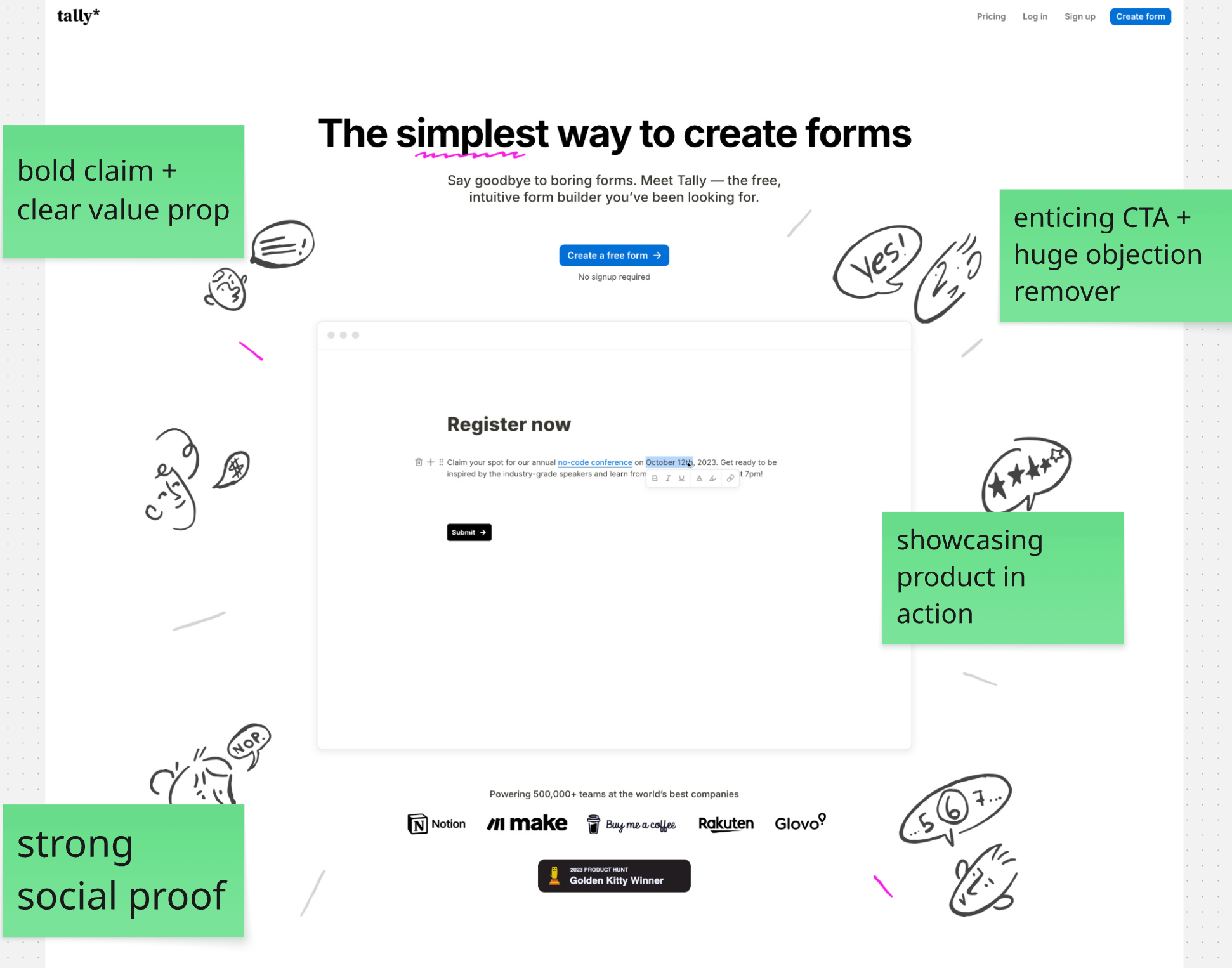
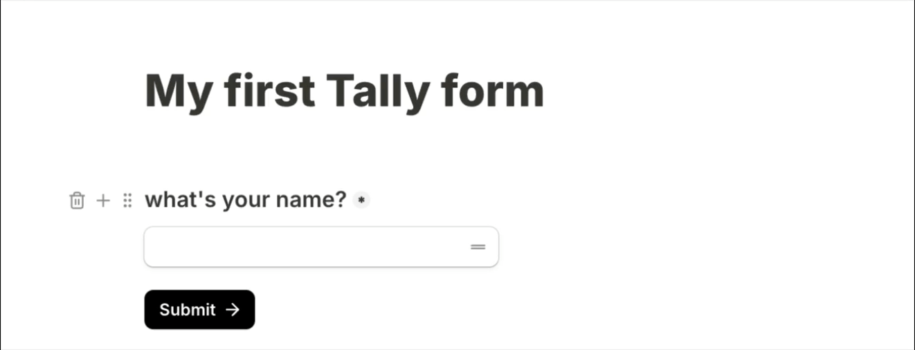
Click "Create a free form" and BAM, you're in the product, ready to create your first form!
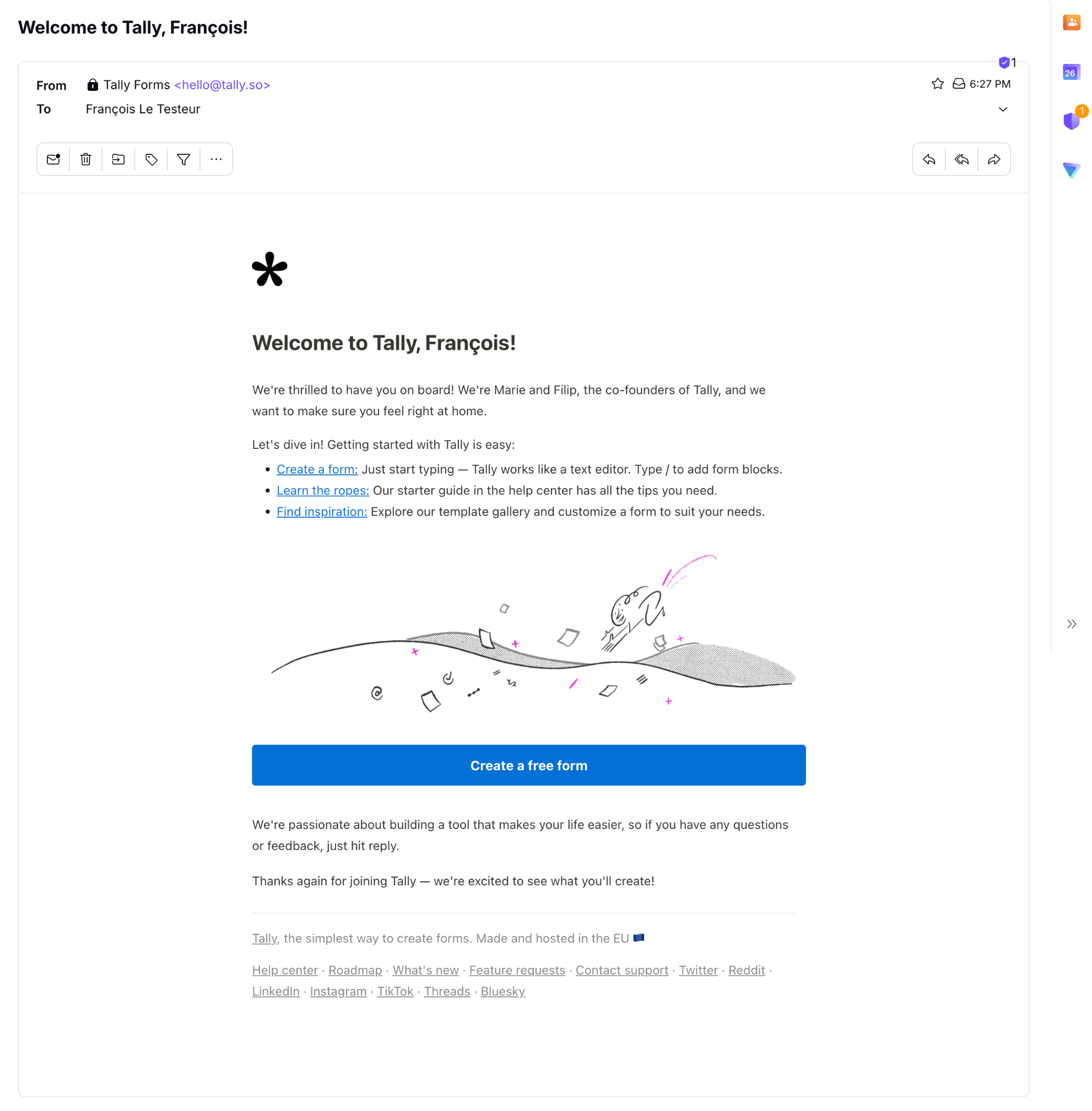
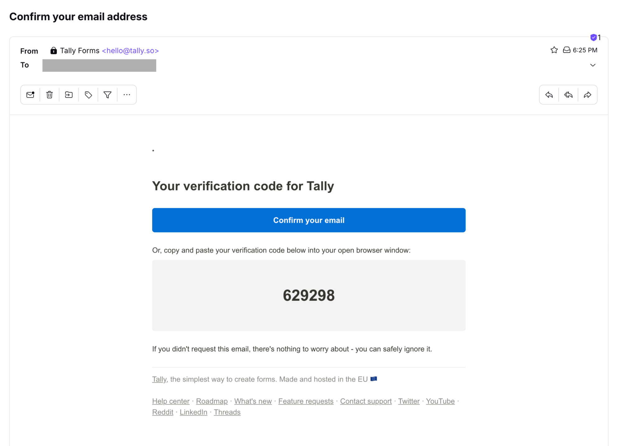
TOP 2 — welcome email + in-app guidance
The welcome email
is critical. If someone signs up but for some reason closes the tab and gets back to their life, the welcome email is here to:
- remind them why they signed up (promised value)
- give them a clear first step toward experiencing value
- provide guidance, support and whatever may be needed to win
- and yes, make the user feel welcomed and seen as a person, not just a row in a table (first impressions matter!)
Here's why I believe Tally's welcome email does great:
- it's concise
- it's warm, energetic/positive and welcoming
- it makes the first step clear and easy to take with the CTA
- it provides 2 other actions that add meaningful value
- it's human, it expresses genuine passion & care, and it's focused on helping the user succeed with the product
- it has useful links in the footer (well if you see them)
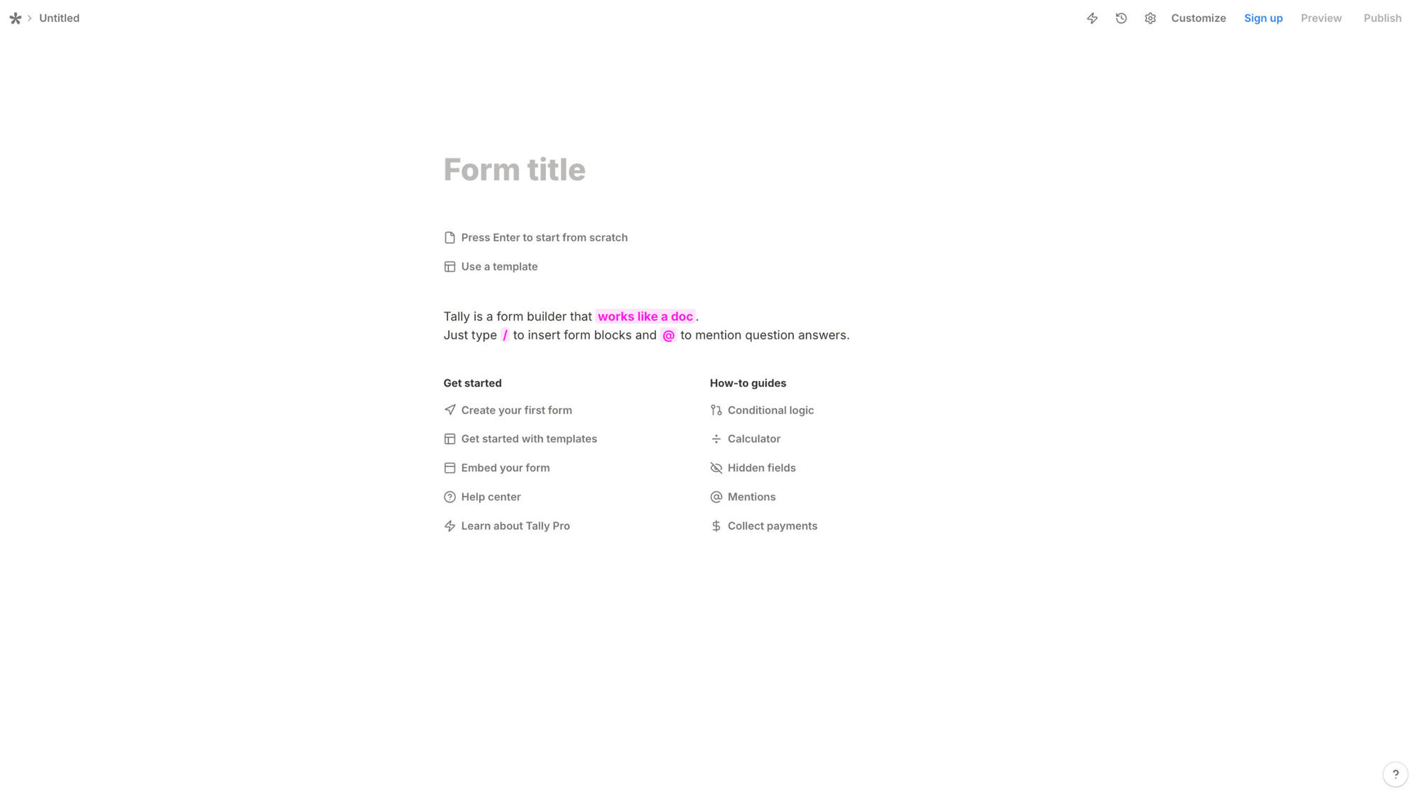
In-app guidance
Tally understands a very important principle: we humans learn best by doing.
So there's no product tour, no tooltip series when you land in the product. Instead, they provide just what you need to get started creating your first form.
They use a simple metaphor to help users understand how it works by connecting it to mental models they already know ("works like a doc", and type "/" to insert form blocks, exactly like in Notion).

They also use subtle animations to attract the attention on UI elements they want users to discover. And they do it progressively, when relevant. This is progressive disclosure in action: you learn new things as you need them, which makes them relevant, and more likely to be learned and memorized by you.

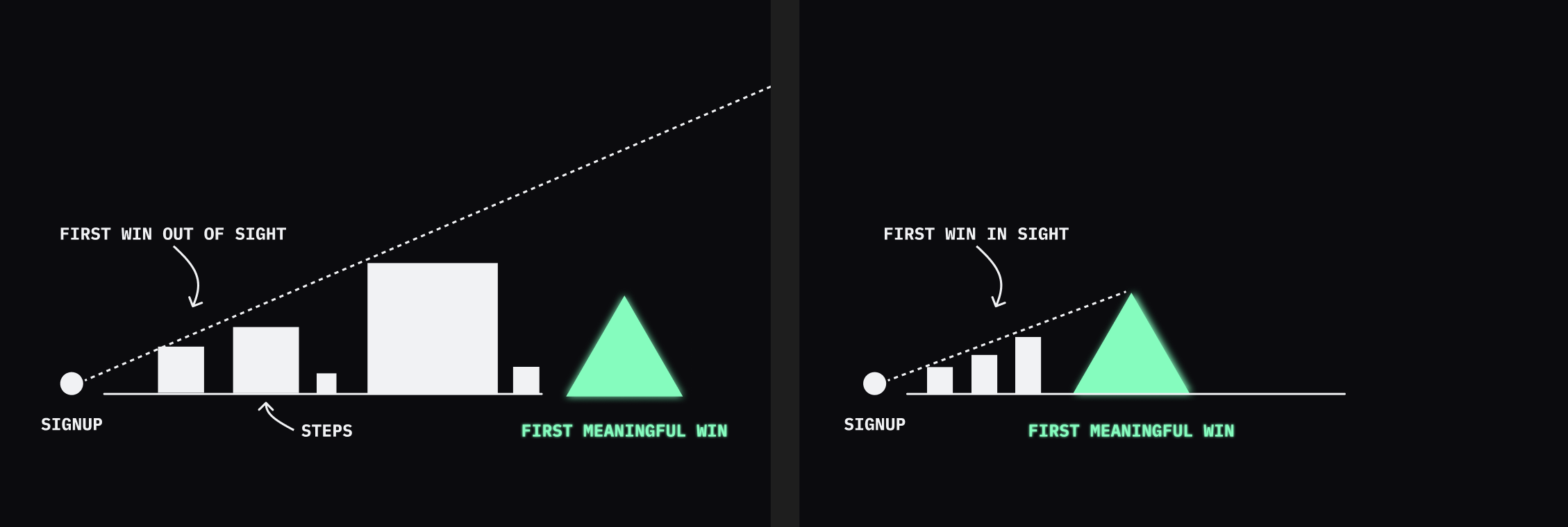
TOP 3 — clear & attainable first meaningful win
This one is not visible on the interface, but it goes a long way: not only does Tally's onboarding have a clear first meaningful win it focuses on (creating and launching your first form), but it makes it feel super attainable.
If there's too much delay/steps/effort/back-n-forths/whatever between signup and experiencing a firs moment of meaningful value, it's inevitable, motivation will decrease over time. And once it reaches a low level, users stall or churn.
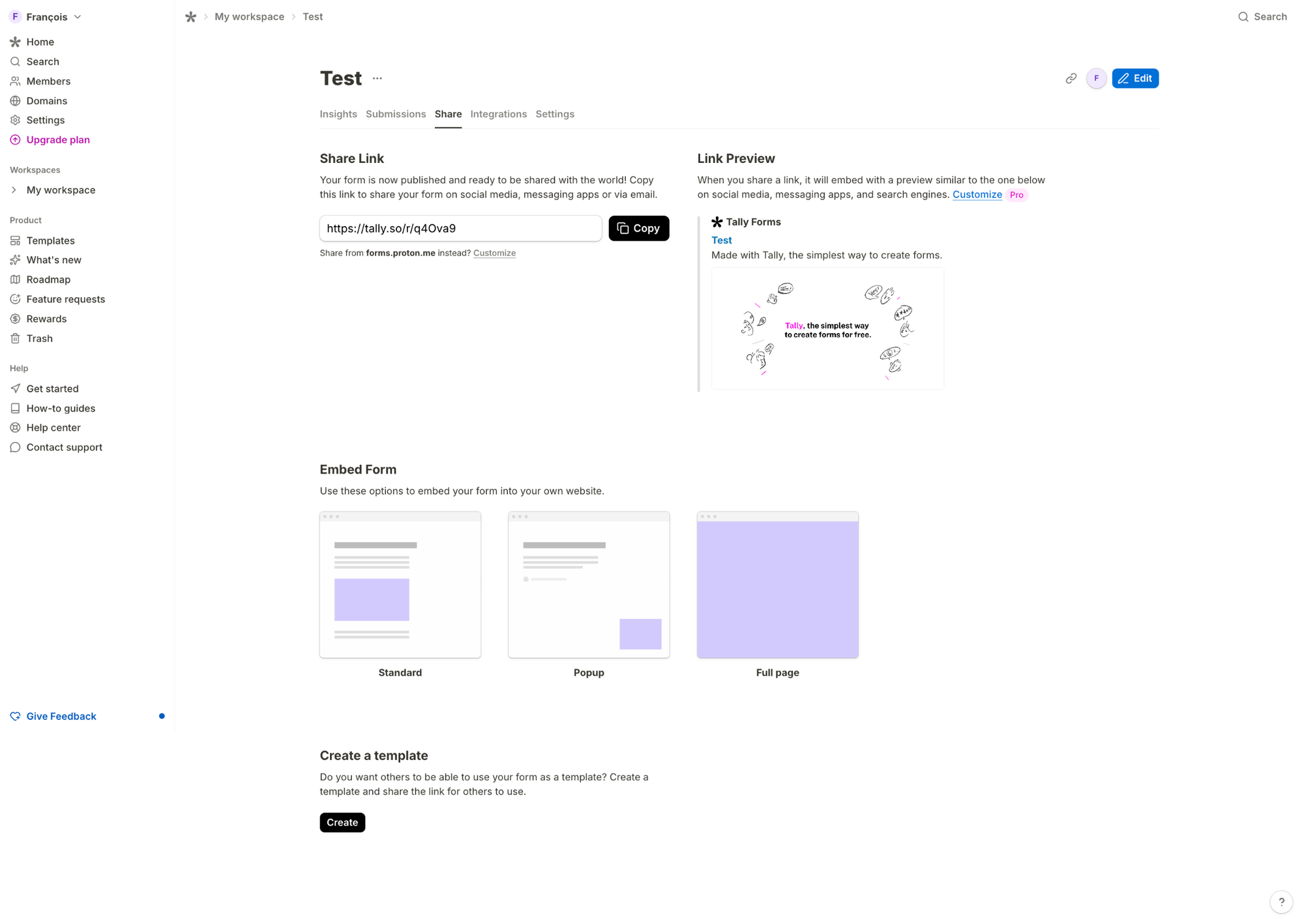
With Tally, finishing your first form (before even having to sign up, and knowing it's gonna be free) makes you feel like publishing it is literally minutes away.
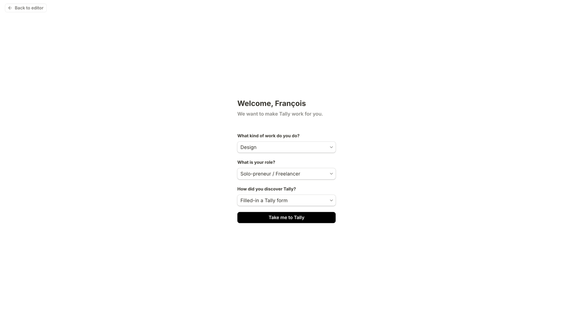
Bonus: frictionless signup flow
This is too important for me not to seize the opportunity to mention it: Tally's signup flow is very quick and seamless.
The Google / Apple SSO options make it very quick to sign up.
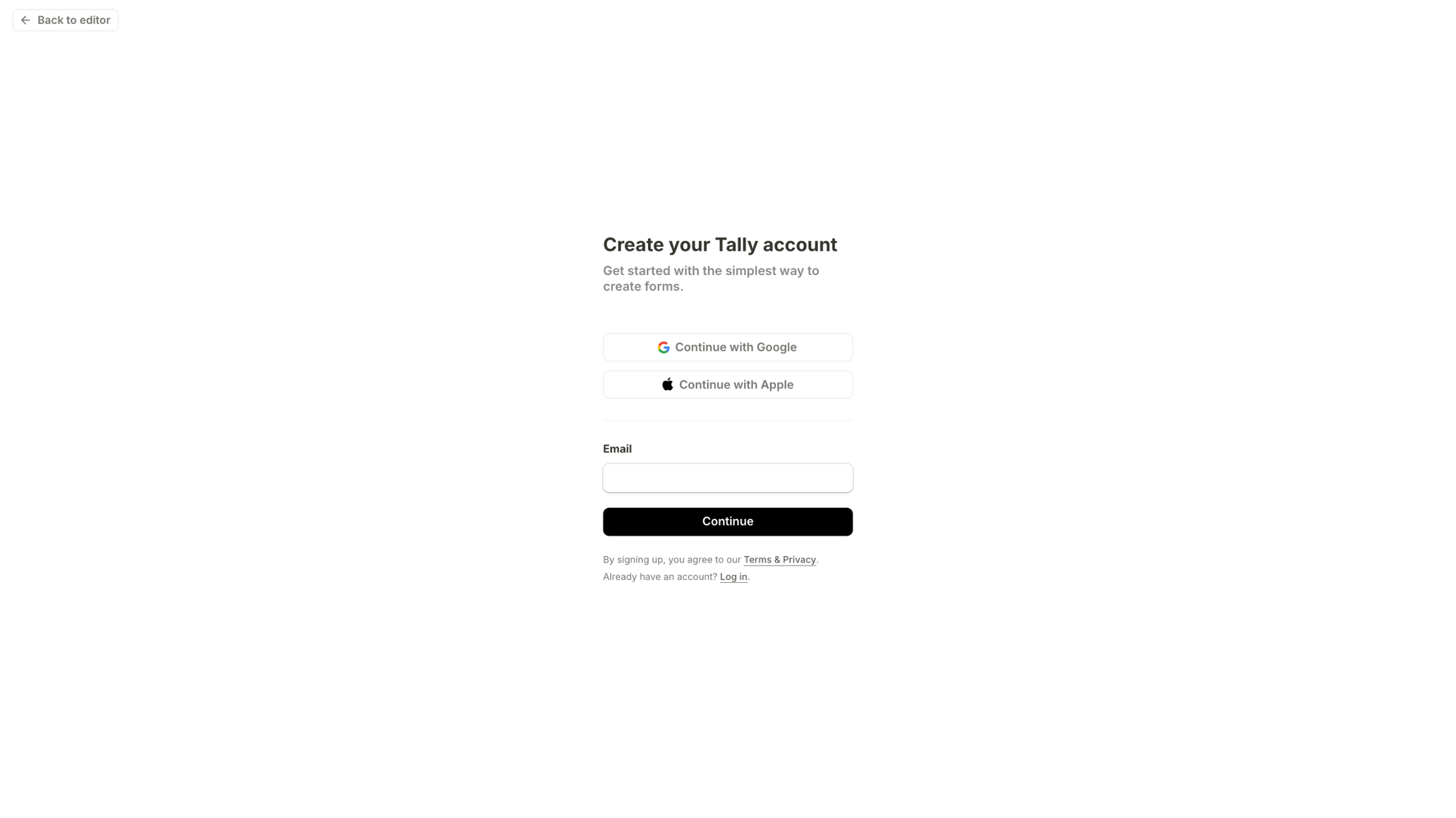
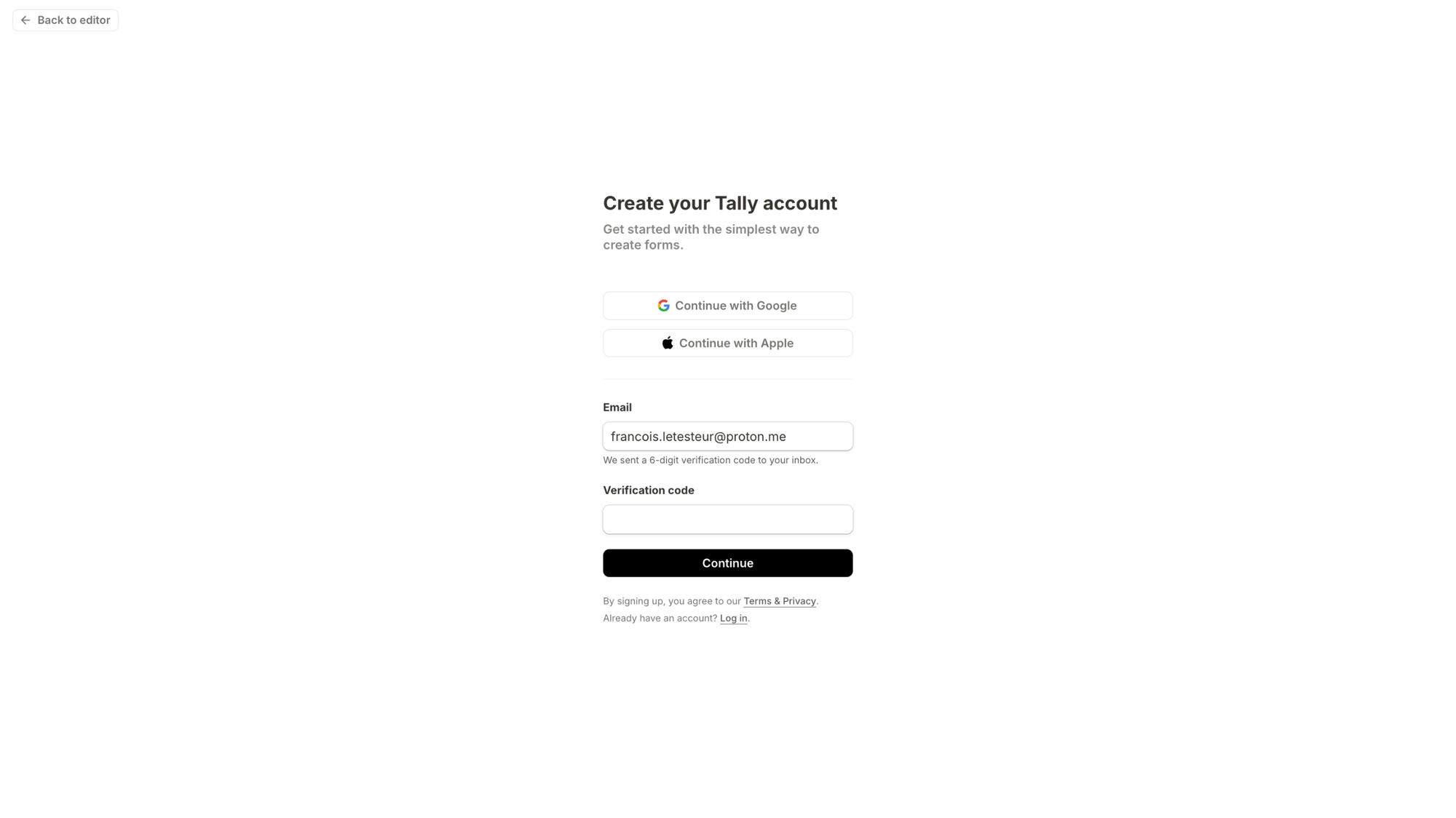
And even if you input an email address, the process is still seamless.
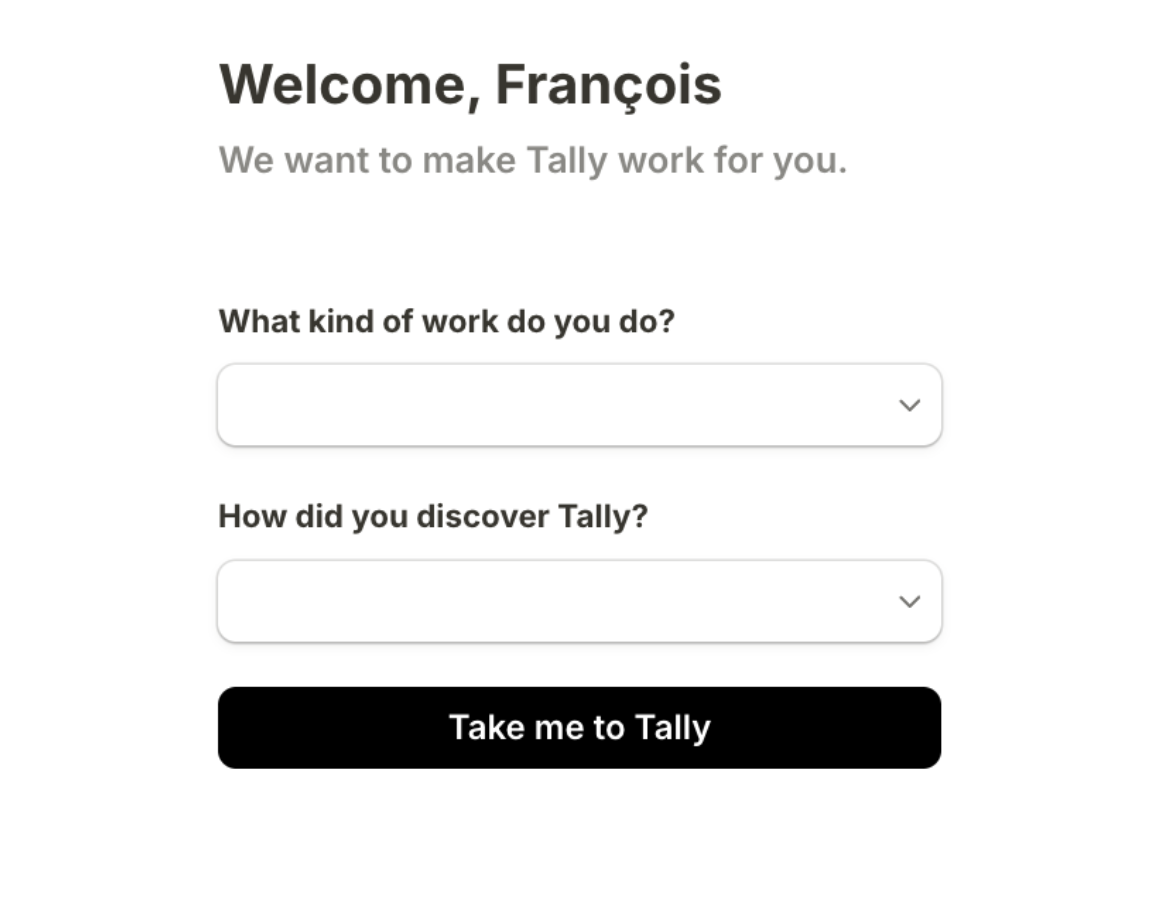
You then have 2 questions to answer (that you can skip — even though it's not that obvious you can skip them 😜)...
and you're ready to publish your first form (with a nice celebration screen that marks the end of the creation phase, and sets up clear next steps and expectations):
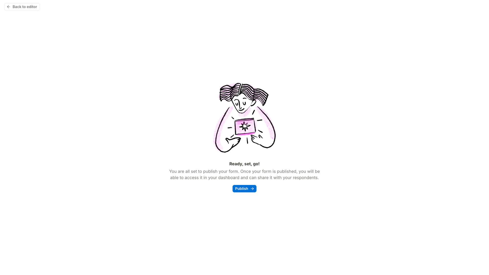
And the second after, there you are, in your dashboard, ready to publish your first form!
Put the free samples outside the shop
What makes Tally's onboarding so effective is the activation actually begins before the signup moment.
As a user, you get absolutely zero barriers between landing on the website and playing with tool. So the moment they ask you to sign up, it actually makes sense and you think "okay, they've let me play with the product and create a form, now they want me to sign up to keep going. Makes sense. And it's free!"
This builds huge trust and safety. Tally gives before asking. That's powerful.
Oh, one small thing... 👀
The questions asked in the signup flow, even though Tally says they're for helping them make the product for you, actually don't. They're marketing questions and they don't personalize your experience depending on your answers.
I don't think it's an issue here, but as a general rule, if your asking questions that don't bring value to users (like personalizing the experience), then I'd rather recommend you ask them later on so you don't add unnecessary friction during the signup flow, which is a very critical moment.
Also, reading Tally wants to make it work for you, and realizing those questions actually don't do anything for you creates cognitive dissonance, a tiny bit of mistrust. Nothing critical, but still worth mentioning.
I hope this was valuable.
PS_
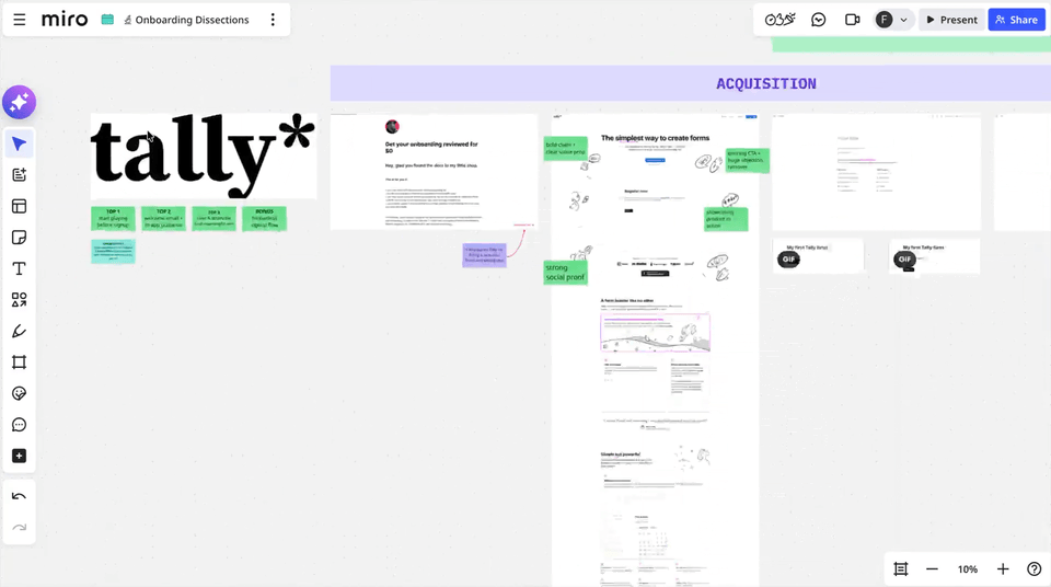
Want me to review your onboarding for $0? Apply here.
I'll share a miro board with screen-by-screen annotations and top recommendations I'd work on first, and why. I'll look at it through both a strategic, user psychology and UX lens, based on the same system I use with clients.
(No commitment, no following harassment with a drip email campaign or whatever)
Senior Product Designer • Activation/Onboarding Specialist
Helping B2B SaaS founders activate, convert and retain more users
Let's talk → LinkedIn | fsimitchiev.com