
[🔬 onboarding dissection] Tella's top 3 activation moves

What is Tella?
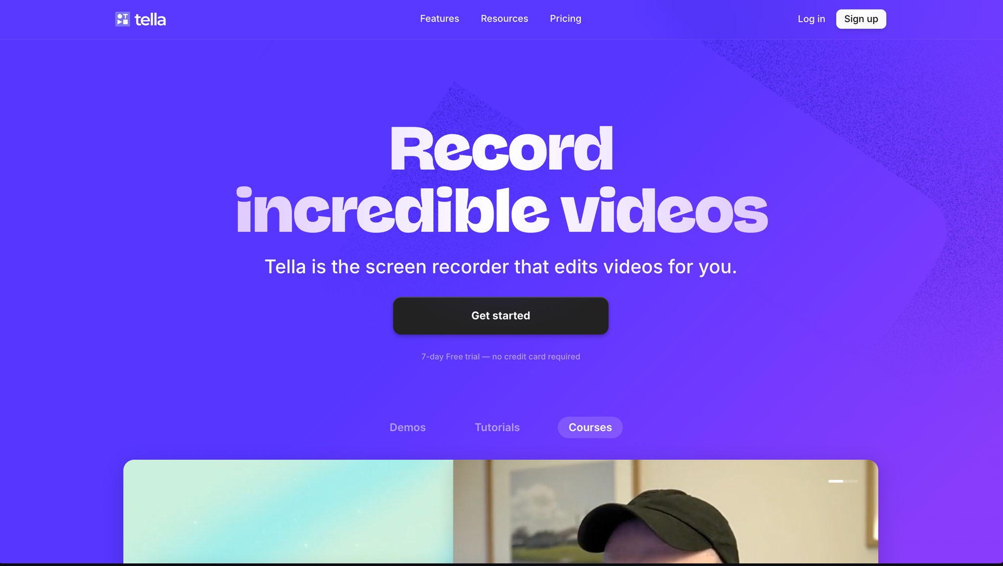
Tella is "the screen recorder that edits videos for you". Basically, it's a sexier version of Loom (feel free to disagree on that, I'm actually fan of both products).
I frequently mention Tella and its onboarding with clients, as I remember they were doing something really well (imho) to onboard new users: showing a "Start here" checklist.
Here's how it looked at the time:
What's great with this page:
- it's what users see first when they land in the product for the first time
- it has its special "👋 Welcome" tab so users can easily find it
- it has 2 sections: Start here and Level-up —all users need in one place
- Start here is only 4 steps (step #1 already done)
- it has a clear first meaningful win (share your first video)
- 100% of the copy is user-centric & value-driven
- it leverages behavioral psychology (step 1/4 already done, you're already making progress to completing the checklist #zeigarnickEffet #goalGradientEffect)
- it uses a bit of fun ("Create your account. Duh.") to create human connection
If we look carefully at this page, we'll notice every single thing the user can click explains clearly what's in it for them. This what i call being user-centric & value-driven.
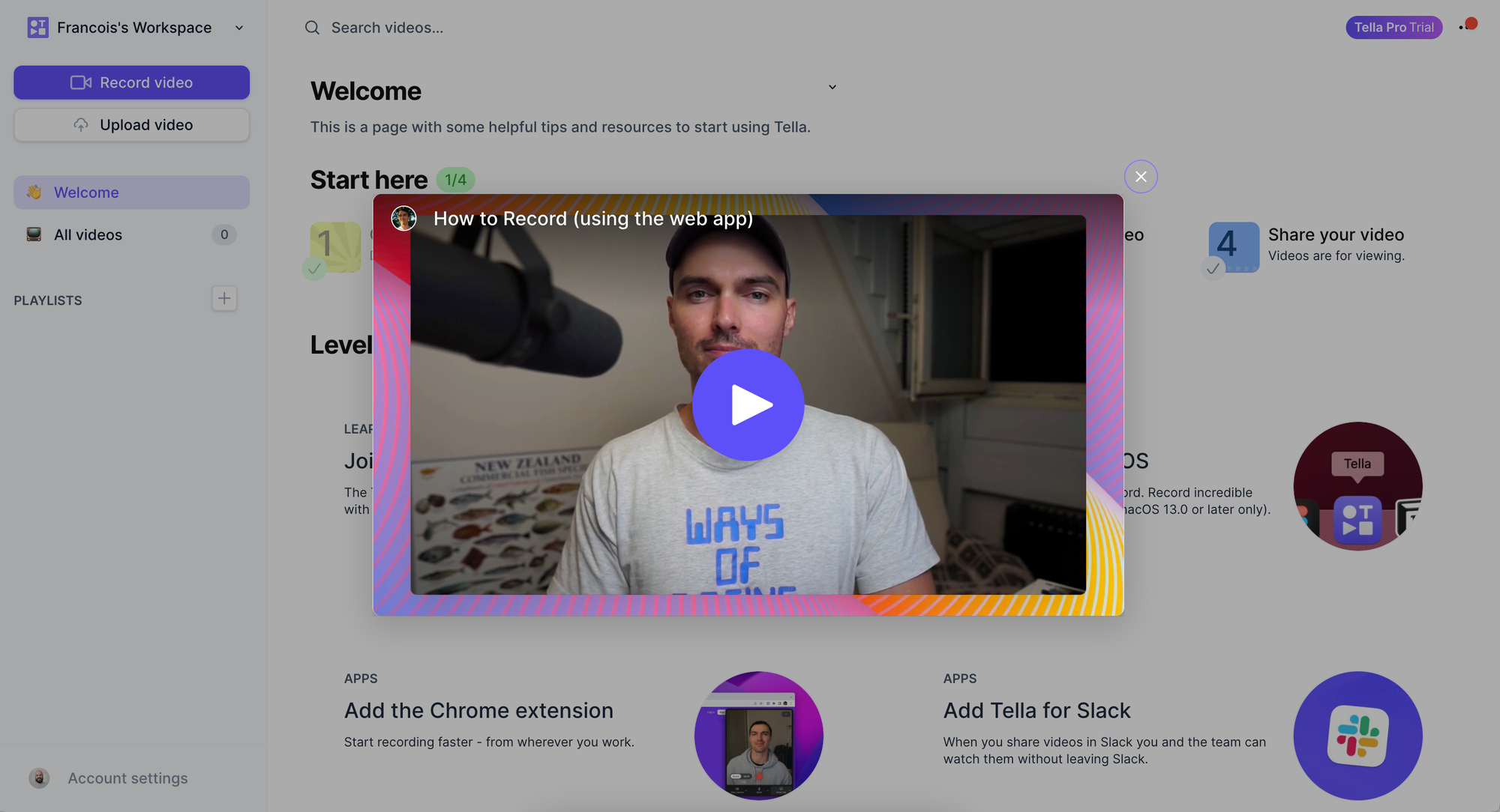
Another thing Tella's onboarding did great at the time was when you hovered on each step of the Start here checklist, you knew you could click to see a popup video with a tutorial for that exact step.
This is progressive disclosure in action. Instead of asking users to go to a place with all learning/guidance content, we present them with just what they need, at the exact moment they need it.
Also, from a cognitive pov, we humans remember more information (like tutorials) when we consume it in the context we need it (when we're doing the thing). Put differently, we learn best by doing.
Now because I'm a fan of how Tella does product (sorry guys I'm still bound to Loom for some reason 😬), i got curious about how their onboarding had evolved since last time I reviewed it.
Let's see Tella's 2026 onboarding flow, and the TOP 3 things it does great (as always, imho).
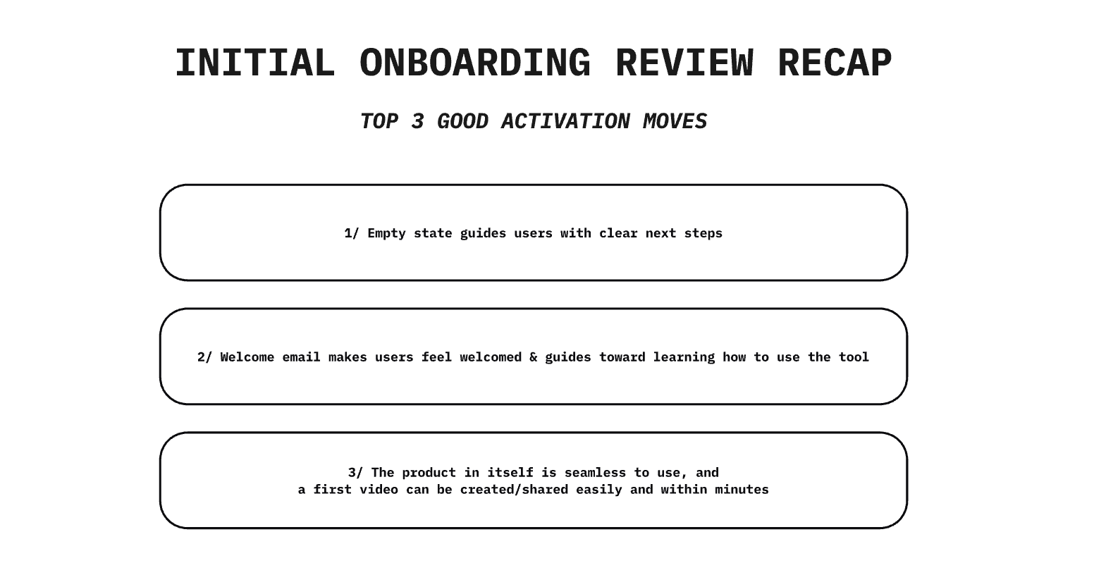
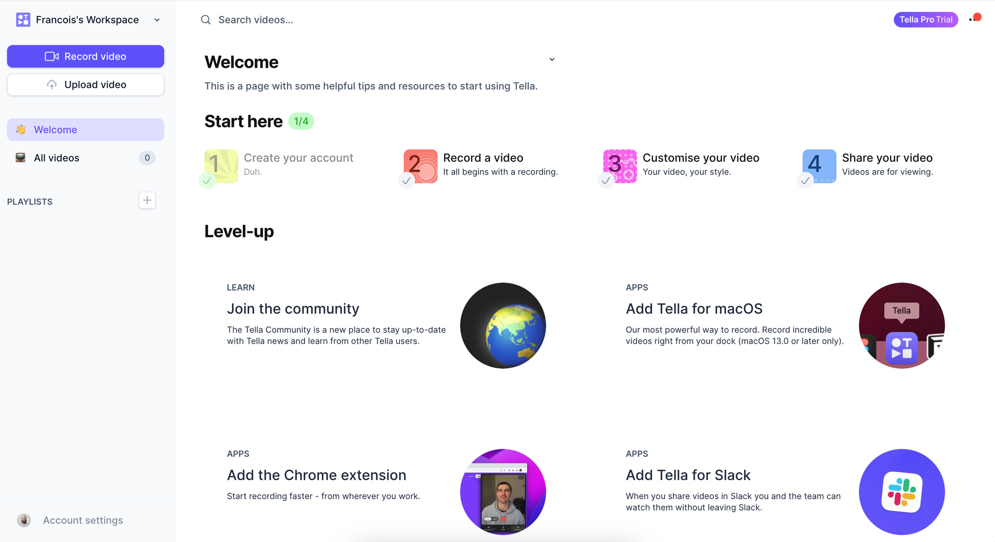
TOP 1 — Empty state guides users with clear next steps
Tella's UI has quite evolved, and we don't see a Start here checklist anymore.
I guess there's a good reason for that as the users Tella attracts must be quite savvy with such tools.
But that's no reason to not guide users when they land in the product for the first time. Empty states are always a great opportunity to do just that.
Here, new users land in the "My videos" section, learning where's the place they'll be able to see their future videos. And instead of an empty page, the empty state guides them with the most relevant next steps: to either learn how to use the product, or start creating their first video.
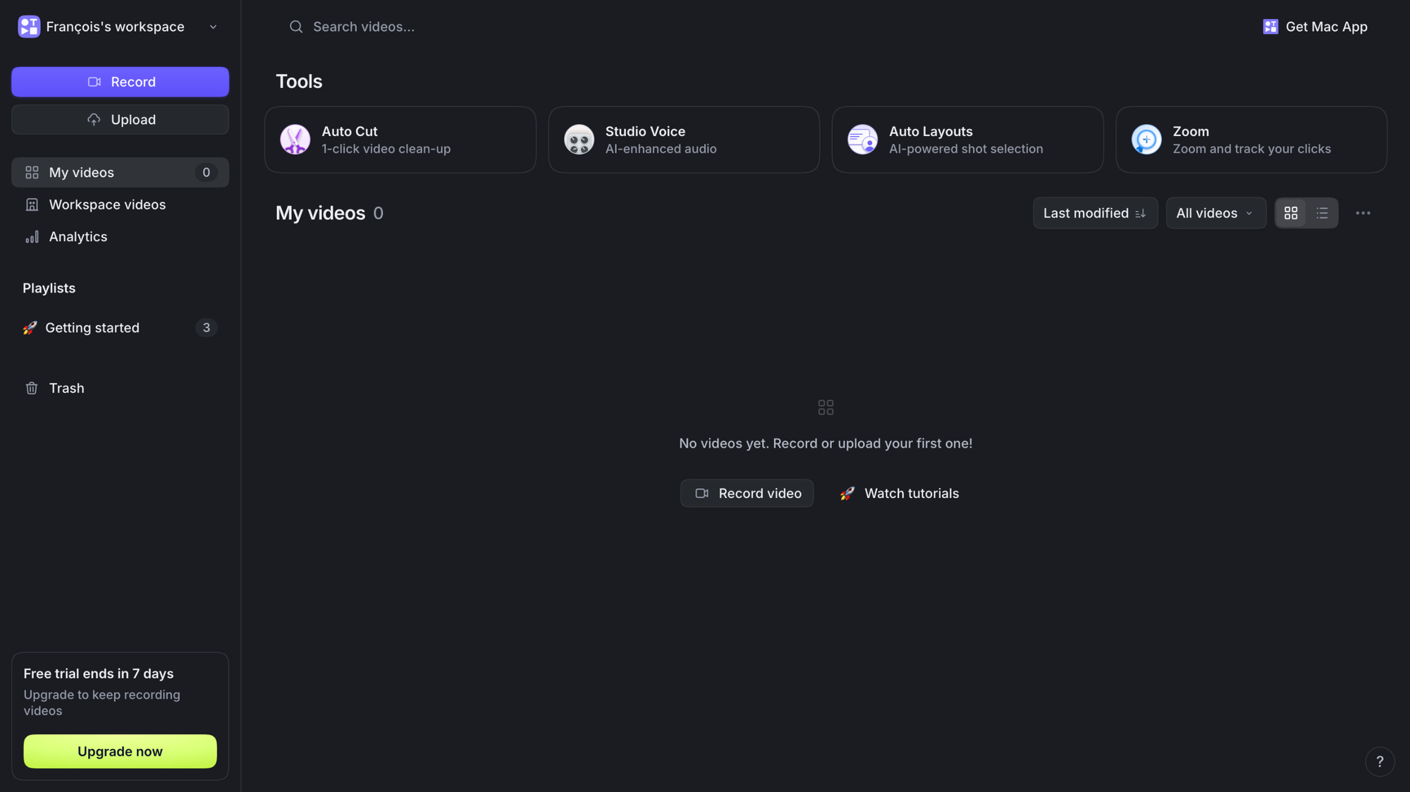
3 more things the UI does great here:
- the most important CTA (Record) is the only component in the brand color on the screen, which makes it easy for users to instantly see it by contrast
- the second most visible element is the "Upgrade now" button (well since the trial is 7 days, an opportunity here could be to hide it for now and reveal it a bit later, so users aren't distracted and can focus on what matters most and will *earn* the upgrade: playing with the tool and experiencing meaningful value from it)
- there still is a "🚀 Getting started" playlist always visible in the nav for users to find the tutorials
TOP 2 — Welcome email makes users feel welcomed & guides toward learning how to use the tool
Again, nothing fancy here but so many products either don't send a welcome email at all, or simply miss the opportunity to greet users and guide them toward experiencing their first meaningful win.
Because a user signs up doesn't mean they won't close the tab the second after. A meeting, coffee break, whatever distraction: life just happens and tabs get closed.
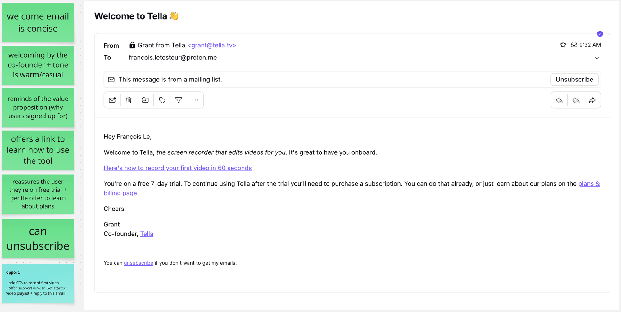
Here's what Tella's welcome emails does great:
- concise (users are busy, impatient, flooded with emails, respect their time)
- welcoming and warm (users are humans, not just rows in data tables)
- reminds the core value of Tella (remind them why they signed up increases motivation to take action and activate)
- valuable link to learn the tool (builds trust and prevents users from being stuck/needing assistance)
- reassure user (free trial + can unsubscribe to avoid spam)
an opportunity I spot: add a link to the core action: record a video.
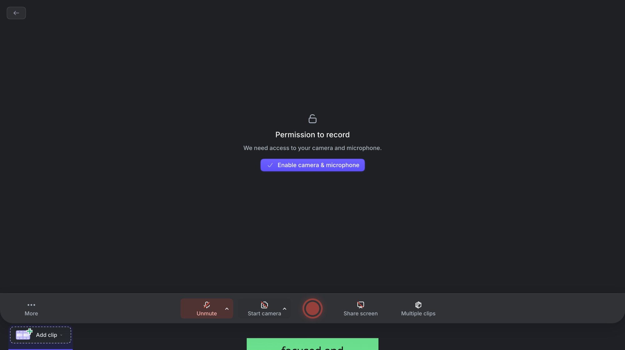
TOP 3 — The product in itself is seamless to use
and a first video can be created/shared easily and within minutes.
A good product should be super easy to learn and use.
What causes users to sign up is known as the Technology Acceptance model. It states if users don't answer with a big YES to these 2 questions:
- do I believe this product can be useful to me? (perceived usefulness, PU)
- do I believe it'll be easy to use? (perceived ease-of-use, PEOU)
they won't sign up.
I may be in obvious territory here, yet I still see many many products that are complex to use (or at least not intuitive to the users they're designed for), which causes the need for human assistance, which means:
- users are not autonomous; they're blocked and frustrated instead
- frustrated users are prone to churn and bad word-of-mouth
- human touch to assist them requires time/people/money as you scale
- it's actually not scalable
and isn't the premise of any SaaS product to be a scalable business?
If our product is poorly designed and we need a support team to help every user, we're in trouble. And this matters especially during onboarding where we're basically aiming at proving our product's value is real, and have users confirm those 2 TAM questions:
- YES, it's useful to me
- YES, it's easy to use
This is how we earn early adoption.
And yes, Tella is — imho — super well designed.
It guides users progressively, one small step at a time during setup:
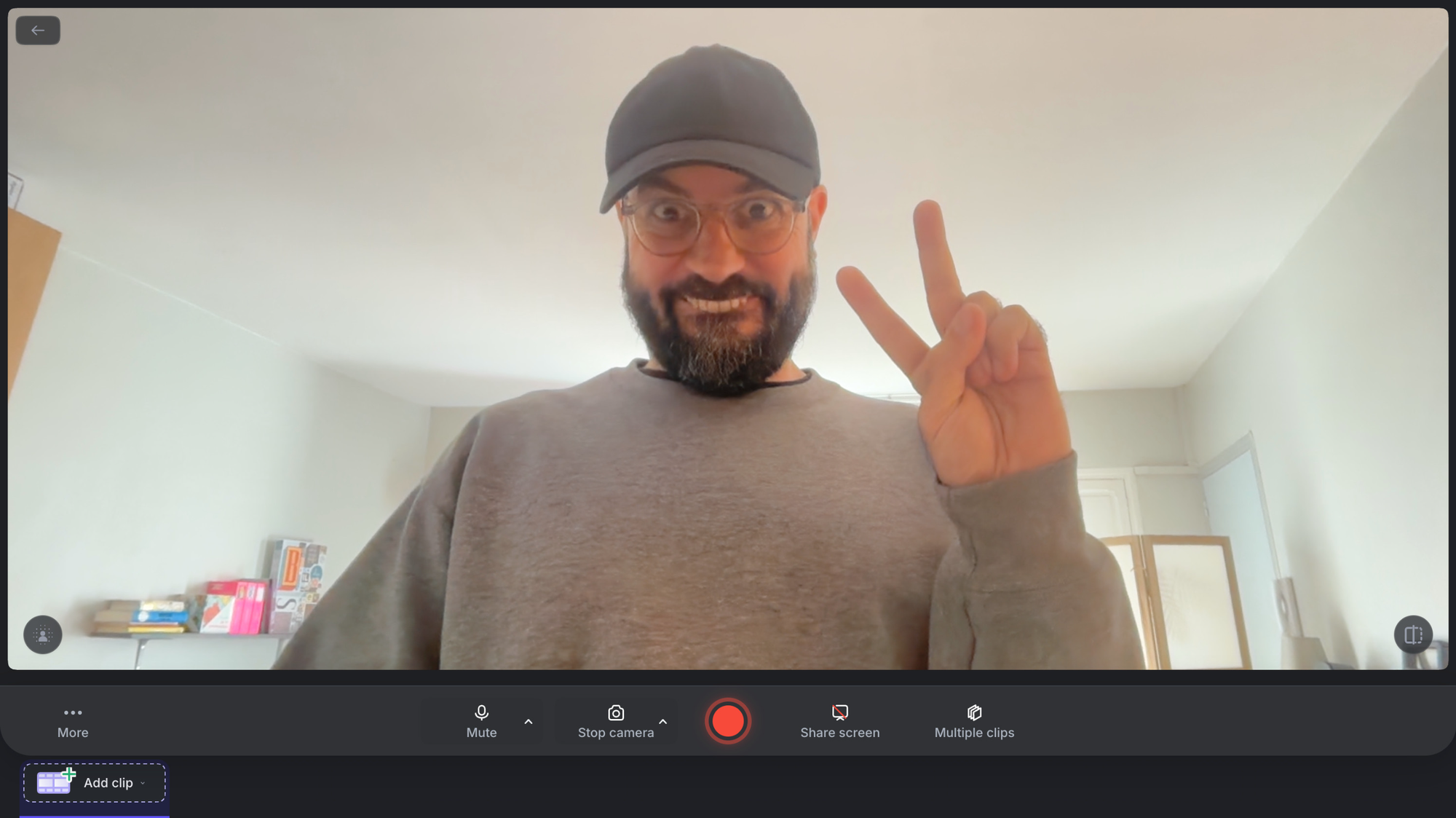
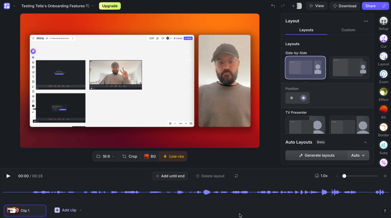
And as you progress you discover editing tools that are easy to understand and use, especially because the interface uses common mental models (recognizable icons, clear labels, visual options/metaphors) and each tweak is rendered instantly.
You're basically playing with the editor.
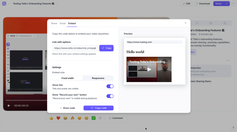
And at the critical moment of configuring how your video will be shared/embedded, the interface shows you how it will behave in context. 👏
This is huge as it removes the anxiety of doing something wrong and feeling embarrassed or incompetent even before it happens.
When you start from the user, everything becomes simpler.
The common thread across these 3 moves?
They all ask:
- what does it mean for our users to win with our product?
- what do they need to reach a first win asap?
- what could go wrong at each step?
Tella's onboarding does nothing revolutionary or incredibly magic.
It just makes confusion impossible.
I hope this was valuable.
PS_
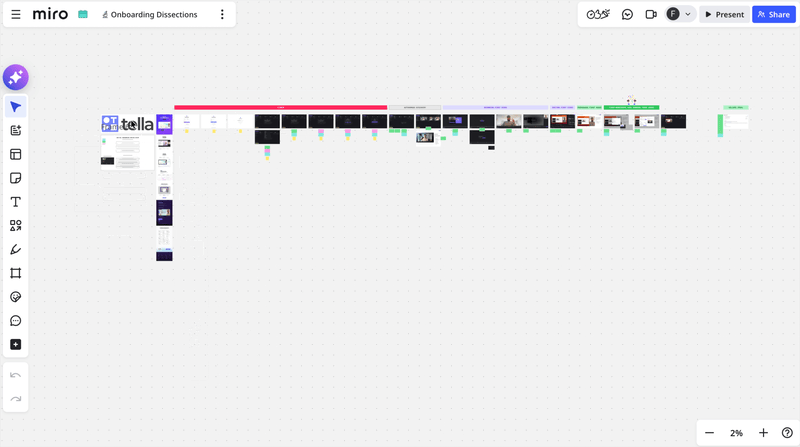
Want me to review your onboarding for $0? Apply here.
I'll share a miro board with screen-by-screen annotations and top recommendations I'd work on first, and why. I'll look at it through both a strategic, user psychology and UX lens, based on the same system I use with clients.
(No commitment, no following harassment with a drip email campaign or whatever)
Senior Product Designer • Activation/Onboarding Specialist
Helping B2B SaaS founders activate, convert and retain more users
Let's talk → LinkedIn | fsimitchiev.com