
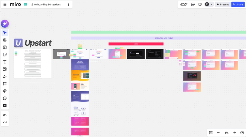
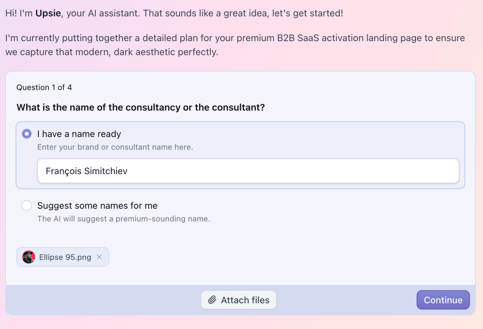
[🔬 onboarding dissection] Upstart top 3 activation moves

What is Upstart?
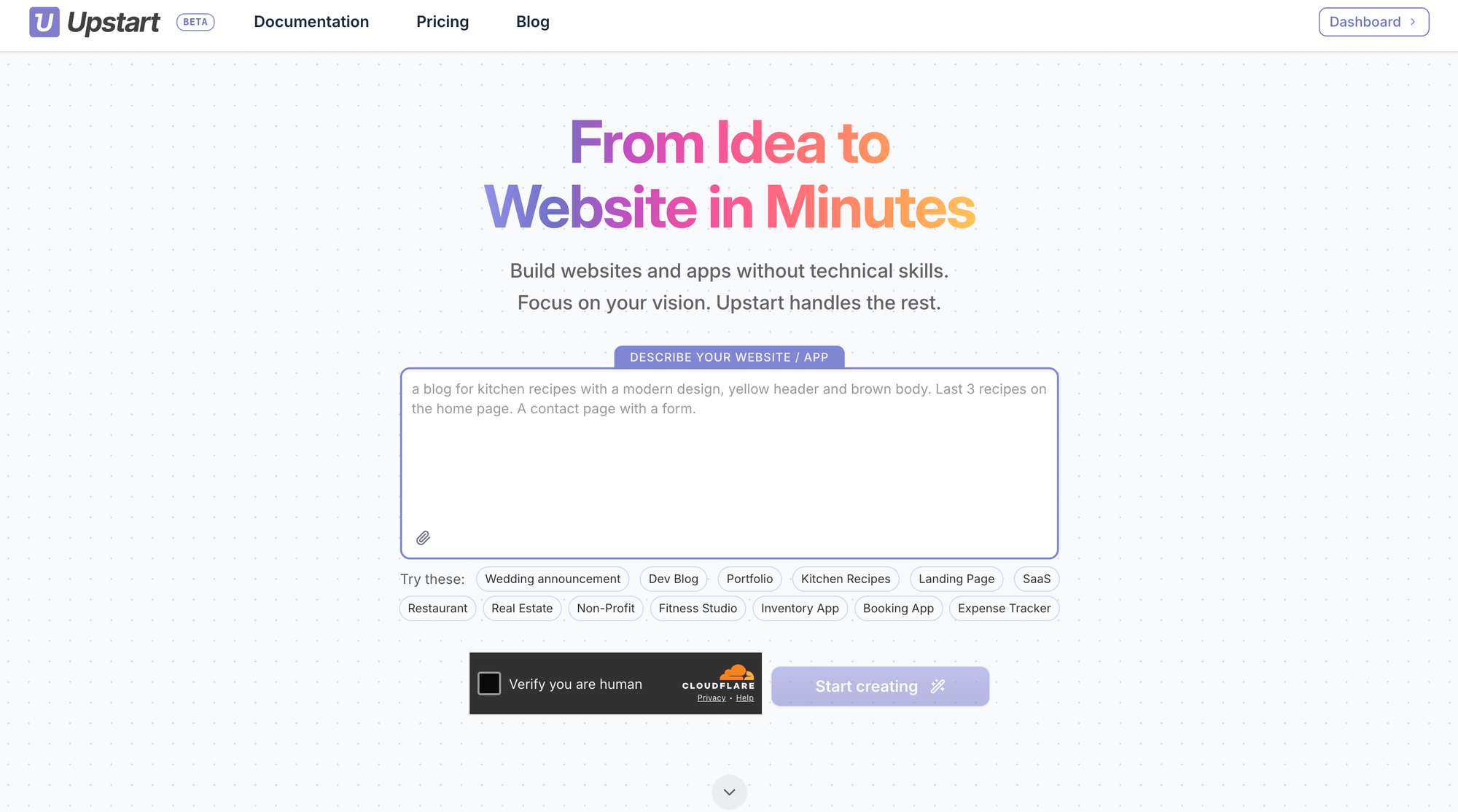
Upstart is an AI-powered website builder.
The promise is simple: build a website in minutes, without writing any code.
The 2 co-founders launched the beta version earlier this month (April 2026). And what strikes me is they've put a great effort on user onboarding from the very start.
So without further do, let's see what are the top 3 things Upstart's onboarding does pretty well (as always, imho).
TOP 1 — Activation starts before the signup gate
The moment you land on the Upstart website, 2 things appear very clearly:
- the value proposition
- a text input invite you to write a prompt
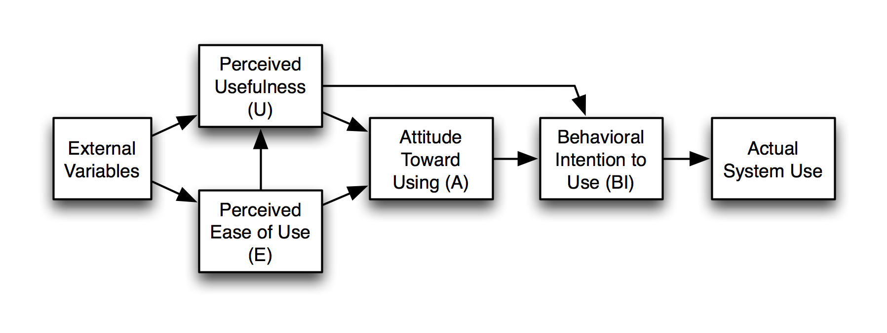
Before you even consider scrolling down the page, the page answers the 2 critical questions that predict usage intent: the Technology Acceptance Model (TAM) questions:
- do I believe this will be useful? (if you need to build a website but don't know how to do it or can't have someone do it for you, you'll definitely answer yes to that question)
- do I believe this will be easy to use? (even though you don't see the product in action, the value promise in the headline + content on the page should have you answer yes to that one too)
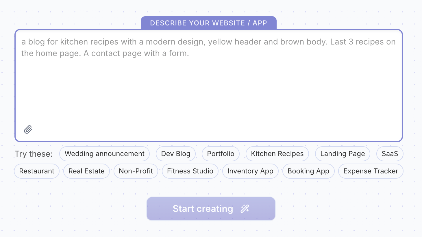
Next, the "Describe your website / app" prompt does a few powerful things too:
- it's a very low-friction first interaction with the product (you don't leave the page, you don't sign up, you don't have to insert your credit card, you don't have anything to do except write a description of what you need. This is the foot-in-the-door technique: a small request first, then a bigger one. Once someone says yes once, they're more likely to keep saying yes to stay consistent with their initial commitment.)
- it opens a curiosity loop ("let's see what this can do for me")
- it activates the IKEA effect (we value/stick to what we can make ours more, especially when we invest effort/time/data)
And to avoid the blank page syndrome, they provide a few "Try these" options so users don't stare forever at the screen and get in motion.
The CTA in the header reads "Sign up free" but the CTA below the prompt input reads "Start creating".
Adding objection removers below the CTA would increase the signup rate (signup happens right after users click that button).
Common objection removers include:
• no credit card required
• access to all features
• no time-limit
•••
By being clear on its value proposition and by offering a very low-friction/effort pre-signup first interaction with the product, Upstarts captures the visitor's attention and maintains it by opening a curiosity loop.
TOP 2 — The system keeps the user engaged until the first meaningful value moment
Once you describe your website and hit the "Start creating" button — YES, you have to sign up to keep going (and i believe placing the signup gate here may be a bit too early and kill the goodwill that was built on the landing page) — but the signup is kept to the minimal user effort required (sign up with Google or only input email + password).
But right after you sign up and until you reach your first meaningful win (FMW), Upstart's onboarding keeps you engaged, which drastically increases the chances you reach that FMW within your first-run experience (making the "from idea to website in minutes" promise true which builds solid trust).
Here are the mechanisms that keep users engaged:
1/ System status visibility
The UI makes sure the user knows their input has been received by the system, and that the system is actually working in the background (and hasn't crashed).
This is one of Nielsen's 10 usability heuristics.
2/ Process visibility
Not only the UI informs when the system is processing, but it tells the user what tasks are being done. Seeing work happen in real time answers the anxious question "is anything actually happening?" before it becomes doubt.
But more than reassurance, it creates anticipation. A visible process turns waiting into watching. The user is now an audience, not a hostage.
There's also a competence signal: showing the tasks (not just a spinner) says "look how much is going on for you." It makes the value feel earned and substantial before the result even lands. This is known as the labor illusion.
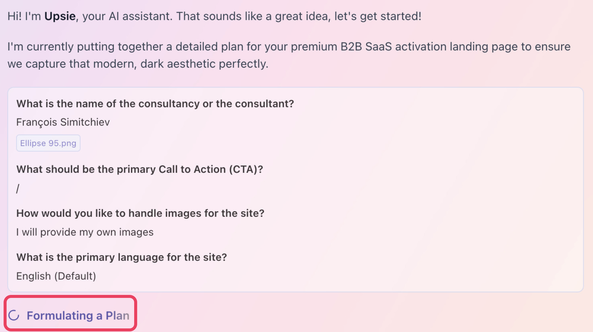

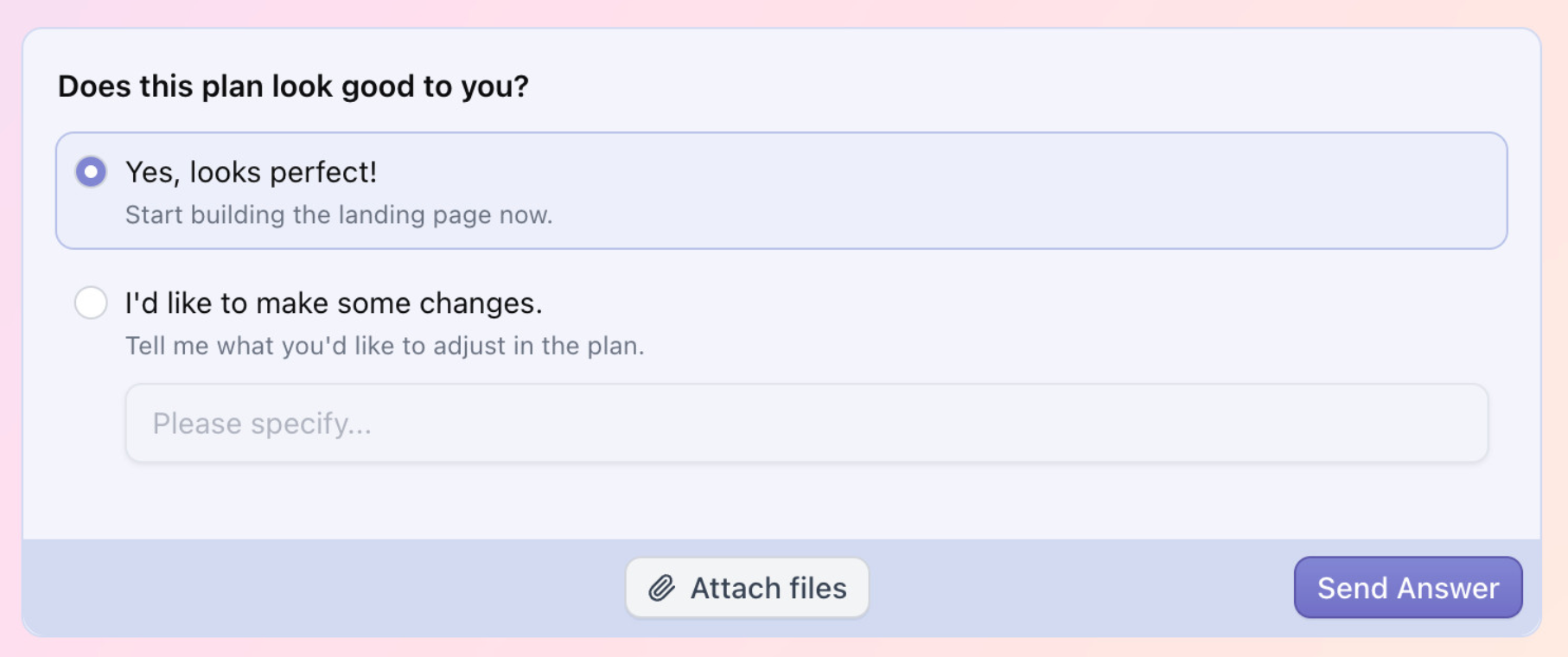
3/ Involving the user
The system also alternates between asking simple questions and having the user review the "detailed" plan before it starts building the website. This way the user has the feeling they are in control.
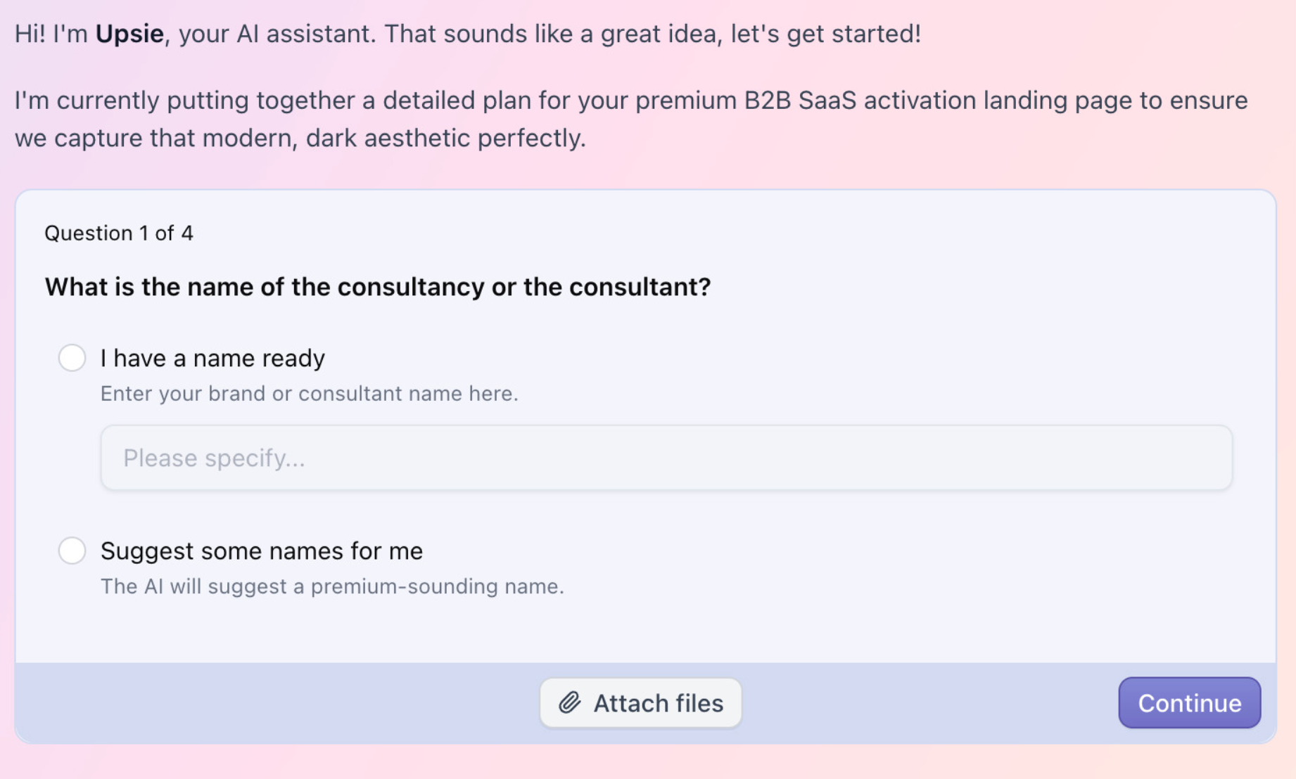
4/ Breaking a complex process in small tasks
Completing small steps reduces the feeling of complexity and increases the feeling of momentum and winning. It also activates the Zeigarnik effect according to which we remember more unfinished tasks (here, build a website in minutes) and have a innate need to seek closure (aka, completing the task). It also activates the goal gradient effect: the closer we get to the goal, the more we husstle to get there.
5/ IKEA effect
The UI allows the user to upload a file (like an image) , increasing the investment in the system (the more we invest time, effort, data and emotions in something, the more we stick to it).
This also reinforces the IKEA effect by letting the user personalize their experience (here, adding a file to make the website even closer to what they need, to them).
•••
By leveraging proven behavioral principles, Upstart's onboarding does a great job at capturing and keeping the user's attention throughout the setup phase, increasing the chances they reach their first meaningful win during their first session.
TOP 3 — Build solid trust
Another critical thing Upstart's onboarding is great at is guiding users with clear explanations for every input/task. No technical jargon, no complex or definitive decisions to make. Everything is done for the entire setup phase to feel as seamless as possible.
Also worth mentioning, the UI copy feels positive, genuine and conversational which helps create a connection with the user.
And maybe the most important thing, Upstart actually delivers on its promise: type a text prompt and have a website built within minutes, without any technical skill involved nor a single line of code.
Upstart's onboarding is a great demonstration of leveraging behavioral principles
Upstart implements many tactics other popular AI-powered website builders leverage (like Lovable).
And as you can see, there's a lot of behavioral psychology involved to capture attention and turn it into engagement.
That's why I like to say it's not only about features, about logic.
It's also and above all about psycho-logic.
And if you want to know more about behavioral frameworks, you can read this article I wrote.
Here are the principles we covered in this article:
- Technology Acceptance Model (usefulness + ease of use)
- Foot-in-the-door (low-friction first interaction)
- Curiosity loop (anticipation before signup)
- IKEA effect (investment = attachment)
- System status visibility (Nielsen heuristic)
- Labor illusion (visible process = perceived value)
- Zeigarnik effect (unfinished tasks drive completion)
- Goal gradient effect (proximity accelerates hustle)
- Micro-wins / dopamine hits (emotional momentum)
- Trust through delivery (promise kept = credibility)
I hope this was valuable.
PS_
Want me to review your onboarding for $0? Apply here.
I'll share a miro board with screen-by-screen annotations and top recommendations I'd work on first, and why. I'll look at it through both a strategic, user psychology and UX lens, based on the same system I use with clients.
(No commitment, no following harassment with a drip email campaign or whatever)
Senior Product Designer • Activation/Onboarding Specialist
Helping B2B SaaS founders activate, convert and retain more users
Let's talk → LinkedIn | fsimitchiev.com